Building a Startup Website That Doesn't Look Like a Pitch Deck
Founders pour weeks into a 70-slide pitch deck and then throw their website together in a weekend. That is backwards. In theory the deck is for investors and the website is for customers, but in reality everyone, investors, customers, and your mom, Googles you before they talk to you. If your website looks like a poorly disguised slideshow, they quietly move on. Here is how to build a startup website that converts instead of one that just pitches.
Why Your Startup Website Matters More Than Your 70-Slide Deck
Your website is your first and often only impression. It is not decoration, it is conversion strategy, trust-building, and brand narrative rolled into one. A deck gets seen by a handful of investors in scheduled meetings. Your website gets seen by everyone, at any hour, often before they have decided whether you are worth a conversation at all.
Get the website wrong and good design cannot save a bad first impression, because there will not be a second one. Without proper design, you are essentially standing on a street corner with a cardboard sign, hoping the right person walks by. The website is where curiosity becomes trust, and trust becomes a signup. That makes it more important than any slide.
Common SaaS Design Mistakes (How to Look Like a Walking Red Flag)
You Think Features Are a Personality
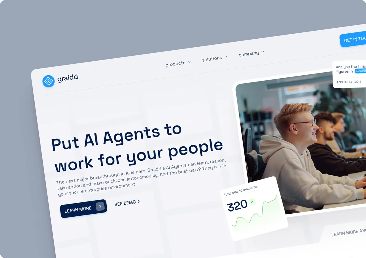
Founders love their features and want to list every one. But a wall of features is not a value proposition, it is a spec sheet. Visitors do not care about your feature count, they care whether you solve their problem. Lead with the outcome you deliver, then let a few key features support it. A website that opens with a feature dump signals a team in love with its product rather than its customers.
Your Landing Page Looks Like an Investor Pitch
The classic mistake: a homepage written for investors, full of market size, traction charts, and grand vision, when the visitor is a potential customer who just wants to know what you do for them. Investor language and customer language are different. Your website should speak to the person deciding whether to sign up, not the one deciding whether to fund you.
You Hide Behind Buzzwords
"Revolutionary AI-powered synergy platform" means nothing. Buzzwords are what teams reach for when they cannot explain their product simply, and visitors see right through them. Plain, specific language always beats impressive-sounding vagueness. If a smart twelve-year-old could not understand what you do from your homepage, the copy is failing.
What Great Startup Websites Actually Have in Common
Brutal Simplicity of Thought
The best startup websites are ruthlessly clear about one thing: what they do and who it is for. They resist the urge to say everything and instead say the most important thing extremely well. This simplicity is not a lack of depth, it is the discipline of knowing what matters most and leading with it. Clarity is the rarest and most valuable quality a startup website can have.
Emotional Proof, Not Just Logical Proof
Facts and features appeal to logic, but people decide with emotion and justify with logic afterward. Great startup websites build emotional proof, the sense that this product gets me, that other people like me trust it, that using it will make my life better. Testimonials, real outcomes, and a confident tone do as much work as any feature list, often more.
Real Visual Identity
A distinctive visual identity signals that you are a real, serious company, not a weekend project. Consistent design, intentional typography, and a look that is unmistakably yours build trust before a word is read. A generic template says you grabbed something off the shelf, while a real identity says you care about the details, which is exactly what customers want to believe about a product they are trusting.
SaaS Design That Doesn't Scream "Please Fund Me"
The goal is a website that feels built for customers, because that is who actually drives your revenue, and ironically that is also what impresses investors most. Investors want to see a company that understands its market and converts its visitors, not one performing ambition for their benefit. A confident, customer-focused website signals product-market fit far better than a homepage full of hockey-stick projections. Design for your users, and the funding appeal takes care of itself, the kind of work our SaaS team focuses on every day.
The Real Cost of a Weak Startup Website
Founders rarely see the cost of a poor website because it is invisible: the visitors who left without a word, the investors who quietly passed, the customers who chose a competitor whose site simply felt more trustworthy. You cannot measure the deals you never knew you lost, which is exactly why a weak website is so dangerous. It fails silently, every single day.
This is the trap of treating the website as a low-priority afterthought. The product might be excellent, the team brilliant, the market real, and none of it matters if the first impression sends people away before they discover any of that. A strong website does not just look good, it captures the value your product and team have already created but that a bad site quietly throws away. That is why it deserves real investment, not a weekend.
But I'm Too Busy Building My Startup! (A Final Word)
Every founder is busy, and the website always feels like something to handle later. But "later" often means launching with a site that quietly repels the customers and investors you worked so hard to attract. Your website is not a chore to check off, it is one of the highest-return assets you own, working every hour to convert strangers into believers. You do not have to build it yourself, but you do have to take it as seriously as the product, because to everyone who finds you online, the website is the product until they sign up. Treat it that way, and it stops looking like a pitch deck and starts working like a salesperson.