UX for Startups: Why Founders Still Think Figma Is Magic
If you’ve ever founded a startup, you know the brutal truth: ideas are easy, execution is messy, and good design is usually treated like an afterthought. The irony? Your first users don’t care about your cutting-edge AI or blockchain wizardry. They care about whether they can actually use your product without crying.
That’s where UX for startups comes in. UX (user experience) is the art of making software usable, lovable, and profitable. Sounds simple, right? Wrong. Most startup founders believe “UX for startups” means finding a freelancer on Dribbble who can make their landing page look shiny. Spoiler: UX is not just about buttons and colors - it’s about understanding your users, reducing friction, and ensuring your brilliant product doesn’t die in the first 30 seconds of onboarding.
As a UX/UI designer who later co-founded an outsourcing company, I’ve had front-row seats to startup chaos. Founders sprint ahead with half-baked wireframes, investors demand “something clickable yesterday,” and suddenly UX for startups turns into duct-tape prototyping. Half the time, my job is less about design and more about therapy: calming down the team, reminding them that users exist, and making sure the onboarding doesn’t look like a tax return form.
Why is UX for startups such a big deal? Because your early users are both your customers and your testers. They’re brutally honest. They don’t care about your pitch deck; they care about not wasting their time. If your app feels confusing, they churn. If your checkout form is slow, they ghost. If your onboarding makes no sense, they uninstall. That’s why UX for startups is not optional - it’s survival.
So in this article, we’ll break down:
The most popular UX methods startups actually use (and sometimes misuse).
The role of UX designers once the “shiny idea” turns into a messy, half-built product.
How investing in UX for startups early saves you from the horror of redesigning everything in the middle of scaling.
Because let’s face it: in startup land, “move fast and break things” sounds cool until you realize what you broke is the user experience - and now nobody’s paying you.
Lean UX is basically the “fail fast, fail often” of design. Instead of spending six months crafting perfect wireframes, you create lightweight prototypes, test them quickly, and pivot. For UX for startups, this method is perfect - it saves time, reduces waste, and keeps you from marrying bad ideas.
Too many founders interpret “lean” as “cheap.” They skip research, skip testing, and call it Lean UX. That’s not Lean; that’s just laziness with a fancy name. The whole point of UX for startups here is to learn fast, not to guess forever.
Pro tip: Lean UX works if you actually talk to users, not just your co-founder who thinks he is the user.
2. Design Sprints – The Startup Bootcamp
Ah, the famous Google Design Sprint: five days of intense workshops where you define, sketch, decide, prototype, and test. In theory, it’s the holy grail of UX for startups. In practice, it often looks like a caffeinated hackathon with too many sticky notes.
The good news? It forces focus. You actually get a prototype in a week, which beats “still ideating” after six months. The bad news? If you don’t have strong facilitation, your sprint ends with a prototype that looks cool but solves nothing.
Still, I recommend Design Sprints when startups are stuck in “idea soup.” They cut through the chaos. Just remember: sticky notes don’t build businesses - execution does.
3. Prototyping & User Testing – Reality Check #1
This is where UX for startups gets honest. You build a clickable prototype (no code needed), throw it in front of real humans, and watch them get confused in real time. It’s painful, humbling, and exactly what you need.
Startups that actually test early save themselves months of expensive mistakes. Startups that don’t? They find out too late that their “intuitive” signup form feels like a tax return.
I’ve watched founders argue with testers: “No, you just don’t get it.” That’s not how UX for startups works. If users don’t get it, the design failed - not the humans.
4. MVP UX (Minimum Viable Product) – The Famous Excuse
Startups love to chant “MVP” as if it’s a free pass for ugly design. But MVP doesn’t mean “terrible UX.” It means launching the simplest version of your product that delivers value. UX for startups at the MVP stage is about stripping down to essentials - not delivering a broken mess.
But: many “MVPs” I’ve seen are so clunky they scare away the very users they were meant to validate. Congratulations - you just invalidated your product idea because you thought UX didn’t matter.
5. Analytics-Driven UX – Because Numbers Don’t Lie (But Can Mislead)
Once the product is live, startups dive into analytics: funnels, drop-off rates, heatmaps. This is the grown-up side of UX for startups - data doesn’t lie. But here’s the trap: numbers tell you what happens, not why.
If 70% of users abandon at step three, the data shows the drop, but not the frustration. That’s why analytics must pair with qualitative research - interviews, surveys, actual conversations. Otherwise, you’ll optimize a funnel nobody even wants.
The Pattern
In short, the most common UX for startups methods work only when applied correctly:
Lean UX saves you from perfectionism, not from research.
Design Sprints give focus, not instant success.
Prototyping tells you the truth, even if it hurts.
MVP UX should validate ideas, not destroy them.
Analytics guide, but they don’t explain feelings.
The sad irony? Startups often treat these methods like fast food - quick, cheap, and disposable. But UX for startups isn’t about shortcuts; it’s about making sure your brilliant idea actually works in human hands.
The Role of UX Designers in the Middle of the Project
So far, we’ve seen how founders flirt with Lean UX, abuse Design Sprints, and release MVPs that look like a Craigslist page. But what happens after the “fun” stage? Welcome to the middle of the project - the awkward teenage years of startup life. This is where UX for startups really shows its value, and where UX designers often feel like both doctors and firefighters.
Enter the UX Designer: Part-Time Therapist, Full-Time Problem Solver
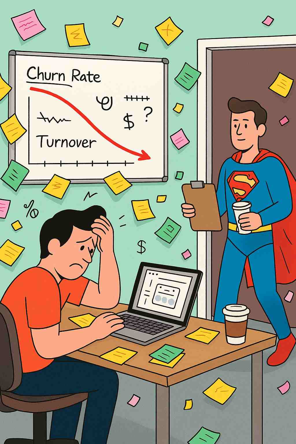
In the beginning, founders think they don’t need UX - just “a nice-looking UI.” Then reality hits: churn is high, conversions are low, and users keep sending angry emails. That’s when a UX designer suddenly becomes the savior.
The role of a designer in mid-project isn’t about drawing prettier buttons. It’s about diagnosing why users don’t stick around, rethinking flows that looked good in Figma but fail in production, and smoothing out all the friction points your rushed MVP introduced. In other words, UX for startups at this stage is less about decoration and more about survival.
Scaling Without Structure – Early prototypes can be messy. But as the product grows, that mess turns into a monster. UX designers bring structure - design systems, consistent patterns, clear hierarchies. Without that, your SaaS feels like Frankenstein.
Broken Onboarding – The most ironic thing in startups: teams spend months building features, but the first five minutes confuse users so badly they never return. A UX designer fixes that by simplifying, guiding, and actually respecting human attention spans.
Data-Driven Panic – At this point, analytics are screaming: users drop at step three, nobody clicks feature X, trial-to-paid conversion sucks. The designer’s role? Translate that panic into action. UX for startups is about connecting numbers with human behavior, not just throwing dashboards at investors.
Investor Pressure – Mid-project is also when investors demand traction. And nothing kills a pitch faster than screenshots of an app that looks confusing. A UX designer ensures the product at least looks investor-ready, even if the backend still feels like duct tape.
⚡️Stop letting messy interfaces kill conversions. Let Integritas Agency optimize your UX
Founders often learn the hard way that fixing UX mid-project costs more than doing it right from the start - but still costs less than launching a disaster. Think of UX for startups as compound interest: the earlier you invest, the bigger the payoff. But even in the middle, a UX designer can rescue what’s broken, polish what’s clunky, and create enough user love to keep you alive until Series A.
And here’s the irony: when done well, good UX looks invisible. Nobody praises the smooth onboarding or the simple checkout. They just use it and pay you. And in startup world, “users pay you” is the only metric that matters.
Final Thought
By the middle of a project, every startup realizes that UX for startups isn’t optional. It’s not a “nice-to-have,” it’s the glue that holds growth together. Without it, your product is just a pile of features. With it, you have something people actually want to keep using.
So, if you’re a founder reading this and you’re still debating whether to bring in a UX designer mid-project, let me make it simple: do it. Because fixing a clunky flow now is still cheaper than explaining to investors why your churn graph looks like a ski slope.
Sofia Shchur
Project manager
Sofia has been a project manager for 10 years, which in startup years is roughly a century. She’s mastered the art of smiling politely while secretly updating the Gantt chart for the 47th time.