Color in Elements of Design: A Comprehensive Glossary and Definitions Guide
Color is one of the most powerful tools in any designer's kit. It evokes emotion, shifts perception, and quietly steers what people do. Used well, it turns a flat layout into something that guides the eye and holds together as a single, coherent message. This guide walks through the core concepts, the properties, the wheel, the systems, and the practical ways color shapes both how a design looks and how well it works.
Exploring Color in Design
Color is the foundation that makes a piece of work both visually appealing and effective. Knowing how to use it well is the difference between a layout that merely looks nice and one that communicates clearly. Thoughtful color choices guide the viewer's eye, create cohesion across a design, and ensure the work conveys the right message rather than just decorating the page.
How Color Influences Visual Perception
Color is among the most essential elements shaping how we interpret and respond to a design. Several factors make its effect so strong:
- Directional attention: vivid, contrasting colors quickly draw the eye toward important areas and relevant information.
- Brand identity: consistent color schemes build a recognizable brand over time.
- Emotional response: colors evoke feelings, blue can suggest calm, red can signal urgency or passion.
- Visual hierarchy: careful use of color creates a clear hierarchy, making content easier to navigate and understand.
Understanding these effects helps you create visuals that are more engaging and that carry real meaning rather than just looking pleasant.
The Role of Color in User Reactions and Actions
Color plays a large, often subconscious role in user behavior, nudging the decisions people make and the actions they take. Applying color deliberately lets designers steer users toward specific actions, like completing a purchase or noticing an important feature. Done thoughtfully, this creates intuitive, impactful interactions that lift both satisfaction and engagement.
Understanding Design Terms for Effective Use of Color
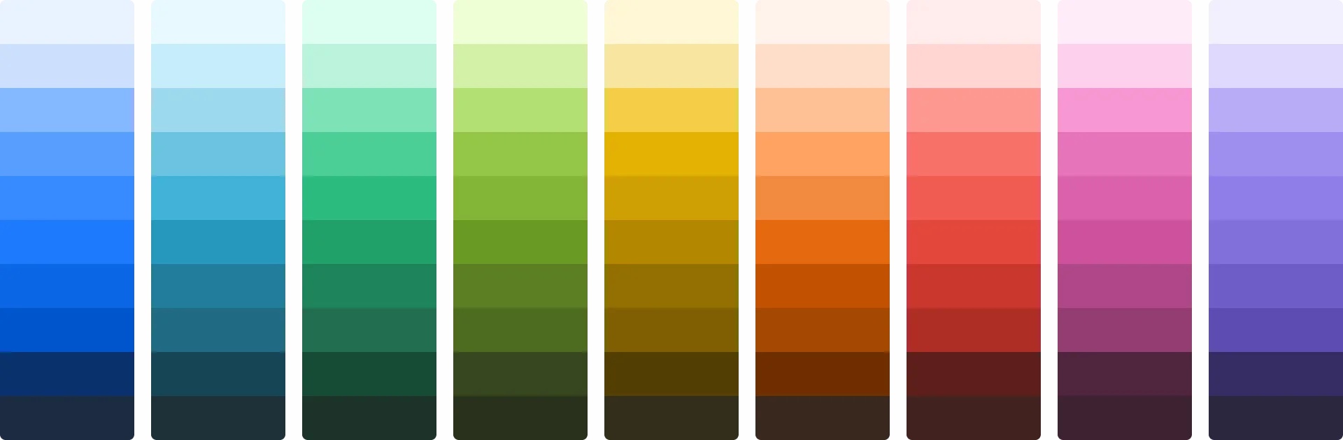
Mastering color comes with clarity on a few key terms that describe how colors relate to and differ from one another. These concepts are the directions that guide designers toward visually pleasing, balanced harmonies, and understanding them gives you the power to make choices that improve both aesthetics and function.
Exploring Color Properties
Each property contributes to how we perceive and interact with color, shaping a design's overall impact:
- Hue is the pure spectrum color, the starting point of any color choice.
- Saturation measures intensity or purity, determining how vibrant or muted a color appears.
- Value refers to lightness or darkness, which strongly affects mood and contrast.
- Chroma measures a hue's purity compared to gray, changing its overall colorfulness.
- Temperature categorizes colors as warm or cool, each evoking a different emotional response.
Mastering these properties lets you manipulate color for precise visual and emotional effects, achieving exactly the result a design needs.
The Significance of the Color Wheel
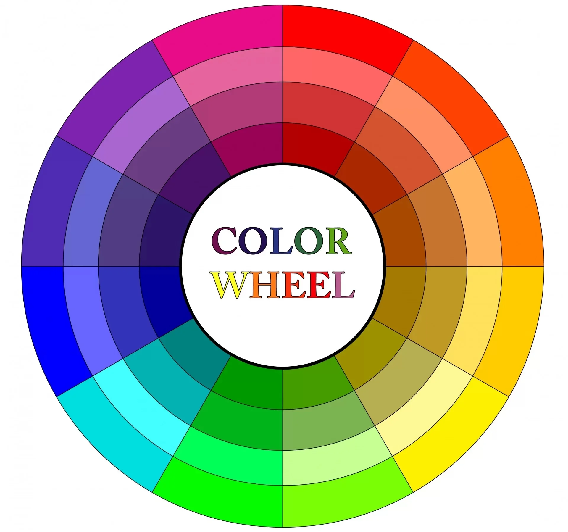
The color wheel is one of the core tools in design, visually showing how colors relate to one another. It helps you understand those relationships and combine colors in a balanced, harmonious way, taking much of the guesswork out of the process. By showing how primary, secondary, and tertiary colors connect, it makes complex color theory far easier to grasp.
Beyond selection, the wheel also clarifies color harmony. Concepts like complementary, analogous, and triadic schemes are far easier to understand when you can see them laid out, and the wheel lets you predict which combinations will work together before you commit. That turns color from trial and error into a deliberate, efficient part of the design process.
Differentiating Color Types
Recognizing color types helps you create more dynamic, interesting visuals, since each type plays a distinct role. Primary colors are the basic building blocks for any strong, harmonious design. Secondary colors are made by mixing primaries, and tertiary colors come from mixing a primary with a secondary, adding extra depth to the range. Understanding how colors shift and transform between these types lets you manipulate them to achieve specific moods and effects, strengthening your visual communication.
Understanding Various Color Systems
Different color systems exist to achieve specific results, each with its own way of mixing and applying color. Knowing them is essential for producing accurate, vibrant work across media:
- RGB (Red, Green, Blue): combines light to produce a wide range of colors, used mainly for digital screens.
- CMYK (Cyan, Magenta, Yellow, Key/Black): a subtractive system that mixes inks in set ratios, used for print.
- RYB (Red, Yellow, Blue): the model taught in art education and the foundation for understanding basic color mixing.
- HSL (Hue, Saturation, Lightness): a digital system that defines colors based on human perception by adjusting hue, saturation, and lightness.
Mastering these systems ensures your work stays consistent and effective across everything from print to digital displays.
Creating Harmonious Color Schemes
Harmonious color schemes are at the heart of designs that are both attractive and practical. On a website especially, the scheme guides attention and sets the intended emotion, so choosing complementary, analogous, and triadic colors carefully creates a balanced look that reinforces the brand's identity and message. Working with different tints and shades of a single color can also produce an elegant, easy-to-read monochromatic scheme. These techniques let you build palettes that please the eye while genuinely supporting a site's purpose.
The Impact of Color in Design
The right use of color can dramatically change whether a visual project succeeds. Colors are not just aesthetic choices, they are tools that carry the message, evoke emotion, and prompt action. Used well, color ensures your intended message comes through clearly and resonates with the audience. Understanding how colors interact and the psychological effects they create lets you build visuals that capture attention and keep people engaged, raising the whole project from forgettable to memorable.
The Long-Term Benefits of Effective Color Use
Strong color decisions deliver advantages that go well beyond looks:
- Customer trust: consistent, well-chosen colors build familiarity, which reassures your audience and signals reliability.
- Conversion rates: strategic color can guide users toward actions like buying or subscribing, subtly influencing decisions.
- Mood setting: color establishes atmosphere, soothing blues for a spa, energetic reds for a sports brand, that matches the message.
- Product differentiation: distinctive color helps you stand out in a crowded market and stick in customers' memories.
- Emotional resonance: color can trigger memories and feelings, turning a one-time visitor into a loyal customer who feels connected to the brand.
Enhancing Design Through Wise Color Choices
Choosing the right colors is essential to any project, and good choices meaningfully extend both a site's aesthetics and its function. By understanding how color affects emotion and behavior, you can create more captivating, effective work that aligns with the brand and its audience. Good choices also make a site more usable and accessible: proper contrast keeps text and key elements readable, helping everyone navigate with ease. In short, color does not just raise a site's visual appeal, it improves performance, satisfaction, and engagement, which is why understanding it matters so much.
Accessibility and Contrast: The Practical Side
One area designers often overlook is accessibility, yet it is where good choices have a measurable, real-world impact. Contrast between text and its background determines whether people can actually read your content, and weak contrast quietly excludes a meaningful share of your audience, including those with low vision or color blindness. Established guidelines, such as the WCAG contrast ratios, give concrete targets to aim for rather than leaving readability to guesswork.
It also pays to never rely on a single hue alone to carry meaning. If the only way to tell an error from a success is red versus green, anyone with red-green color blindness is left guessing, so pair the hue with an icon, label, or shape. Thinking about accessibility from the start does not limit creativity, it sharpens it, pushing you toward palettes that are both striking and genuinely usable for everyone who lands on the page.