
Short answer: Solo founders build their sites between sales calls, so the same UX mistakes recur: homepage overload, confusing navigation, no clear call to action, weak mobile experience, missing social proof, generic visuals and no feedback loops. None are disastrous alone, but together they quietly cost signups—and most take an hour, not a redesign, to fix.
The UX Mistakes That Quietly Sink Solo Founder Websites
Solo founders wear every hat, which means the website usually gets built between a sales call and a support ticket. The result is a predictable set of UX mistakes, none of them disastrous on their own, all of them quietly costing signups. The good news is that they are common, recognizable, and fixable without a designer on payroll. Here are the ones to hunt down first.
1. Information Overload on the Homepage
Founders try to explain everything at once, because everything feels important when you built it. The result is a homepage that reads like a pitch deck with no hierarchy, where the visitor's eye has nowhere to land and nothing to do. Overwhelmed people do not convert, they leave.
Fix it: Treat your homepage as a conversation starter, not a whitepaper. Lead with one clear headline, one primary call to action, and enough space to breathe. The goal is to make the next step obvious, not to win the argument in the first scroll.
2. Confusing Navigation
When users cannot find what they want in about five seconds, they bounce. A cluttered or inconsistent navigation is a silent killer, because nobody emails to tell you they got lost, they just disappear. Founders often add nav items every time they build a new page, and the menu slowly becomes a junk drawer.
Fix it: Keep your top navigation to five or six items at most, with labels a stranger would understand instantly. For long pages, use anchor links instead of burying things in nested dropdowns. Clarity in navigation is one of the cheapest UX wins available.
3. No Clear Call to Action
It is surprising how many solo founder sites forget to actually ask for the lead, or worse, scatter six competing CTAs that cancel each other out. When everything is a priority, nothing is, and the visitor quietly opts out of choosing at all.
Fix it: Choose a single primary call to action per page and make it impossible to miss. Repeat it at natural decision points as the visitor scrolls. One clear, confident ask outperforms a wall of options every time.
4. Poor Mobile Experience
Well over half of web traffic is mobile, yet many solo founders test only on the desktop where they built the site. Visitors arrive on a phone to find tiny fonts, awkward scrolling, and layouts that quietly broke somewhere around the second section. Each of those costs trust in the first few seconds.
Fix it: Test on real devices, not just a shrunken browser window. Design mobile-first so the small screen is the priority rather than an afterthought, and pay special attention to forms and buttons, which is where mobile experiences most often fall apart.
5. Lack of Social Proof
Visitors do not take your word that the product is good, they look for evidence that other people already believe it. A site with no testimonials, logos, reviews, or numbers asks for trust while offering none in return, which is a hard sell to a stranger.
Fix it: Add real social proof and put it where decisions happen, near your CTAs. Client logos, short testimonials with names, usage stats, or case study links all work. Even a little credible proof dramatically lowers the hesitation that kills conversions.
6. Generic Visual Design
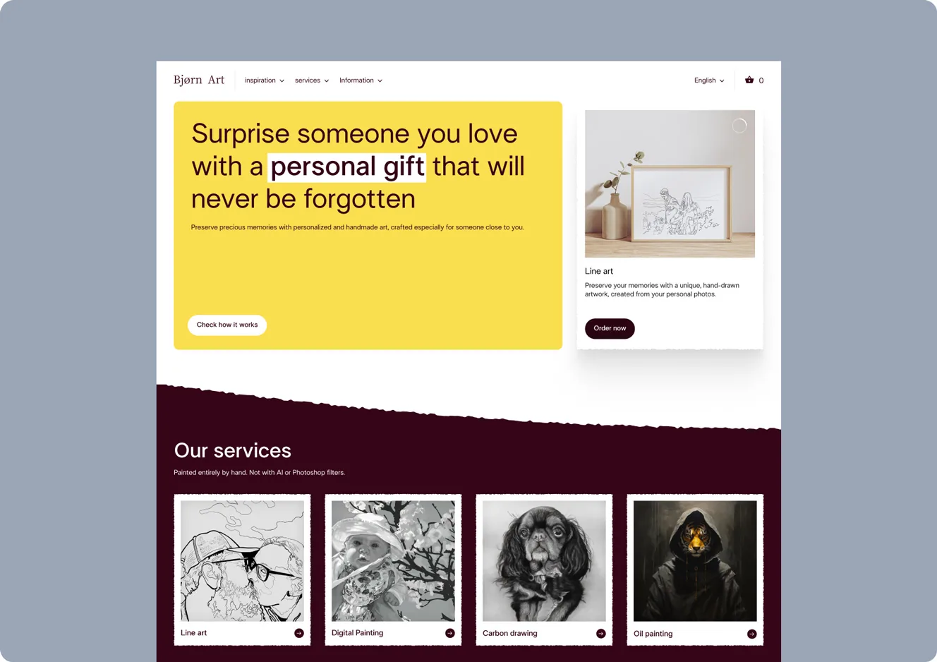
A template that looks like ten thousand other sites sends a quiet signal: this business grabbed something off the shelf. For a side project that might be fine, but for a product asking people to trust and pay, that flicker of "seen it before" works against you. Generic design is not neutral, it is a small handicap.
Fix it: You do not need a full custom build to look intentional. Consistent colors, a distinctive typographic choice, real imagery instead of obvious stock, and attention to spacing go a long way. The aim is to look like you cared, because visitors read care as competence.
7. No Feedback or Validation Loops
The most damaging UX mistake is shipping the site and never learning from it. Without analytics, heatmaps, or any way to see where visitors struggle, every future change is a guess, and guesses are how the same mistakes survive for years. You cannot improve what you never measure.
Fix it: Set up basic analytics and watch where people drop off. Add a lightweight way to gather feedback, even a single question. Then actually act on what you learn. A site that improves based on real behavior will quietly out-convert one frozen in its launch-day assumptions.
The Pattern Behind All of Them
Look closely and these UX mistakes share one root cause: building for yourself instead of the visitor. The founder who knows the product intimately forgets what it is like to land on the site cold, confused, and impatient. Every fix above is really the same discipline, stepping out of your own head and designing for the stranger who has thirty seconds and a dozen other tabs open.
How to Audit Your Own Site in an Hour
You do not need to hire anyone to catch most of these UX mistakes, just an honest hour and a willingness to be your own toughest critic. Start on your phone, not your desktop, because that is where most visitors actually arrive. Pretend you have never seen the site before and try to answer two questions in the first ten seconds: what does this company do, and what am I supposed to do next? If either is unclear, you have found your first fix.
Then walk the path a real customer would. Count the calls to action on each page, and if more than one is competing for attention, simplify. Look for social proof near your key buttons, and add it if it is missing. Check whether your copy leads with benefits or buries them under features. If you have analytics, find the page where most people leave, because that exit point is almost always where a UX mistake is hiding. The audit itself is easy. The honesty to act on what it reveals is the part that actually changes your numbers.
Why Small UX Fixes Beat a Big Redesign
Solo founders often assume that fixing their site means a daunting, expensive redesign, so they put it off indefinitely and the problems compound. The truth is more encouraging. Most conversion damage comes from a handful of specific issues, a buried CTA, a confusing menu, a broken mobile layout, that you can fix one at a time without rebuilding anything.
This matters because incremental fixes are something a busy founder can actually do. You do not need to block off a month and a budget. You need to address the single biggest leak this week, measure the result, and move to the next one. A series of small, deliberate UX improvements will quietly outperform the big redesign you keep meaning to commission, and you can start this afternoon.
Final Thought
You do not need a design team or a big budget to fix the UX mistakes that hold most solo founder sites back. You need the willingness to see your own site as a first-time visitor would, prioritize clarity over completeness, and let real data guide the next change. Tackle these one at a time and the site stops working against you and starts doing the quiet, constant job it was built for: turning visitors into customers.

_3i6ymkeomclke0w7.webp)

_11zon(1)_3i6y1bgme9j9oxz.webp)
