
_3i6y1psormuf876mu.png)
Getting traffic is only half the job. A website can rank well, attract visitors through SEO, and still generate very few leads if the design does not help those visitors take the next step. One dataset puts the average SEO conversion rate at around 2.4%, meaning that most of the visitors arriving through search still do not convert.
This is where web design starts to directly affect business results. A clear landing page, strong visual hierarchy, simple navigation, persuasive content, and an obvious CTA can make it easier for visitors to understand your offer and act on it. Conversion rates can vary significantly between ordinary pages and dedicated, optimized landing pages, so the goal is not simply to bring more visitors - it is to turn more of the right visitors into leads.
How Web Design Impacts Conversion
A website redesign can have a measurable impact on conversion - the strongest results usually come from research, testing, and purposeful design changes, rather than simply making a website look newer.
- Hubstaff + VWO: a redesigned homepage was tested with 259,000 visitors over three months. The new version increased visitor-to-trial conversions by 49% and homepage email submissions by 34%.
- Majestic Wine + VWO: a redesigned page increased enquiry form submissions by 201%. A further optimization - removing a distracting PDF button - produced another 36.9% increase.
- TruckersReport + CXL: after six rounds of testing, the landing page conversion rate increased from 12.1% to 21.7% - a 79.3% improvement. The process included analytics, heatmaps, session recordings, audience research, and multiple design tests.
- Walmart Canada: a responsive redesign increased overall conversions by 20%, while mobile orders increased by 98%. The redesign was supported by usability testing, A/B testing, and research into how visitors used different devices.
These examples show an important point: web design is not just visual. Layout, hierarchy, messaging, navigation, forms, CTAs, mobile experience, and even the amount of information on a page can influence whether a visitor continues toward a conversion or leaves.
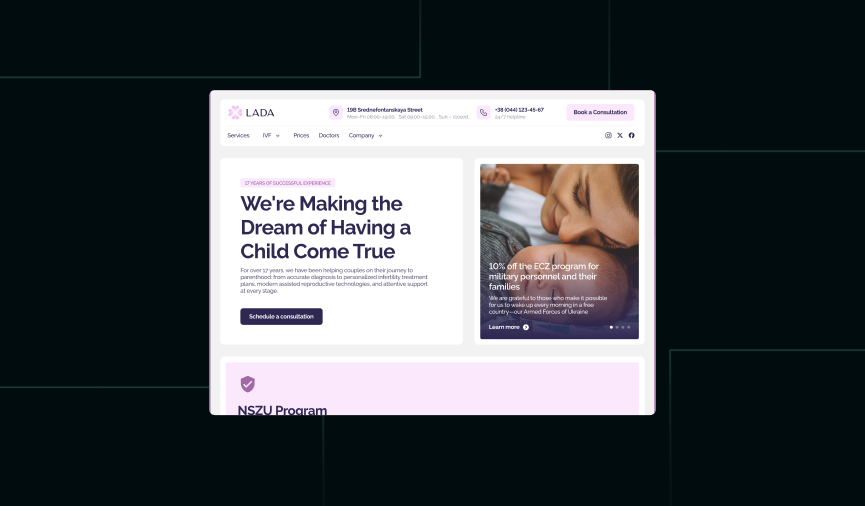
Here’s one of our case studies where a website redesign and SEO improvements increased traffic and conversions.
What to Know Before Creating a High-Converting Website Design
Before creating a high-converting website design, we need to understand more than just how the company wants the website to look. The discovery phase should give us a clear picture of the market, competitors, services, search demand, and existing visitor behavior. This research becomes the foundation for decisions about the sitemap, content, user journey, and visual design.
Competitor Research
We start by looking at how competitors position themselves online. This means more than comparing colors and visual styles. We analyze their sitemap, page structure, messaging, service presentation, calls to action, forms, and the way they move visitors from the first interaction toward an enquiry.
The goal is not to copy what competitors are doing. It is to understand what visitors in the industry already expect, identify gaps in the market, and find opportunities to create a clearer and more convincing experience.
Services Research
A website can only convert when visitors quickly understand what the company offers and why it matters to them. That is why we research each service before deciding how it should be presented on the website.
We look at the differences between services, the problems they solve, the types of customers they are intended for, and the questions people are likely to have before making a decision. This helps us create service pages that are not simply descriptions, but useful conversion points that guide visitors toward the next step.
Keyword Research
Keyword research connects the website with the language potential customers actually use when searching for a service. It helps us understand what people are looking for, how specific their searches are, and which topics deserve their own pages.
These insights can influence the sitemap, landing pages, headings, content structure, and even the way services are named. When SEO and design are considered together from the beginning, we can build pages that are easier to find and easier for visitors to understand.
Google Analytics Research
If the company already has a website, its existing data can provide valuable insight before we redesign anything. Google Analytics can show where visitors come from, which pages receive the most traffic, how users move through the website, and where they leave.
We can use this information to identify pages that already perform well and areas where visitors may be dropping off. Instead of starting from zero, we use the existing data as a baseline and make design decisions based on actual visitor behavior.
Research Becomes the Design Foundation
All of this research comes together before the visual design starts. It helps define what pages the website needs, what each page should achieve, what information visitors need at each stage, and where conversion opportunities should appear.
The result is a design based not only on how the website should look, but on who is visiting, what they are looking for, and what should happen next.
Best Practices for a More Effective Website
Before thinking about layouts, animations, or visual details, you need to understand what the website is actually supposed to achieve. An effective website starts with a marketing strategy that defines the message, audience, and customer journey behind the design.
1. Sitemap Design
The sitemap defines how the website is organized and how visitors move through it. We decide which pages are needed, how they are connected, and what role each page plays in the customer journey.
A good sitemap should work for both users and search engines. It creates a logical path from informational content to service pages, landing pages, and ultimately conversion points. This structure also gives us a foundation for creating a website that is easier to navigate, understand, and optimize.
2. Style Direction
Before designing every page, we establish the visual direction of the website. This includes typography, colors, imagery, UI elements, layouts, and the overall visual language.
The goal is not simply to make the website look good. The style should support the brand positioning and create the right perception for the target audience while keeping important information and conversion points easy to understand. A strong visual direction also creates consistency across the entire platform, so visitors know what to expect as they move between pages.
3. Page Design
With the structure and style direction approved, we move into the design of individual pages. Each page is designed around its specific purpose, audience, and stage in the customer journey.
We consider content hierarchy, headlines, CTAs, forms, trust elements, navigation, and visual hierarchy to make important information easy to find and the next action clear. Different page types — from service pages and landing pages to case studies and blog articles — can therefore serve different roles within the overall strategy.
The design should also reflect the intent behind each page. An informational article may focus on education, while a commercial service page should provide enough context, proof, and clear calls to action to support conversion.
4. A/B Testing
Design decisions should not end when the website goes live. A/B testing allows us to compare different versions of a page or element and see how real visitors respond.
We can test headlines, CTAs, layouts, forms, content placement, and other elements to identify opportunities for improvement. For example, we might test two different hero sections on a landing page to see which one generates more enquiries.
Combined with analytics, testing turns the website into an ongoing optimization process rather than a one-time design project. Instead of relying only on assumptions or personal preferences, we can use real visitor behavior to continuously improve the experience and conversion rate.
UX Methods We Use
Good UX is not just about making a website easy to use. It is about reducing friction between what a visitor wants and what the business wants them to do. We use different UX methods throughout the process to understand user behavior, identify problems, and create a clearer path to conversion.
User Journey Mapping
Before creating key pages, we map out how different types of visitors are likely to interact with the website. We look at where they come from, what they already know, what information they need, what questions they may have, and what could stop them from taking action.
For example, someone searching for a specific legal service may arrive directly on a landing page without knowing anything about the company. They need to understand the service, see why the company is qualified to provide it, find evidence of previous results, and have an obvious way to make an enquiry. Mapping this journey helps us place the right information and CTAs at the right points in the conversion path.
User Flow Analysis
User flows help us understand the steps required to complete an important action. We analyze whether there are unnecessary pages, confusing decisions, or points where visitors may lose interest.
For example, if the goal is to generate a consultation request, we can map the journey from landing page → service information → proof or case study → contact form → confirmation. If a visitor has to search through several pages before finding the form, there may be an opportunity to simplify the flow and improve conversion.
Information Architecture
Information architecture determines how content is organized and how easily visitors can find it. This is especially important for websites with many services, locations, products, or educational resources.
Instead of putting every service under one generic “Services” page, we might create separate service categories and dedicated pages based on how customers actually search for and understand them. A clearer structure can also make the platform easier for search engines to understand and navigate.
Content Hierarchy
Visitors rarely read a website from top to bottom. They scan headlines, subheadings, short paragraphs, images, buttons, and other visual cues. Content hierarchy helps us make sure the most important information is noticed first.
For example, a service page might start with a clear statement of what the company offers, followed by the main benefit, supporting information, proof such as testimonials or case studies, and finally a strong CTA. The design should help visitors understand the value of the service without requiring them to read every paragraph.
Heatmaps & Session Recordings
For an existing website, tools such as heatmaps and session recordings can show how people actually interact with the interface. Instead of relying entirely on assumptions, we can see where visitors click, how far they scroll, which elements they ignore, and where they appear to struggle.
For example, if an important CTA sits halfway down a page but most visitors never reach it, the problem may not be the CTA itself. The information hierarchy or page design may need to change.
Usability Testing
Usability testing puts the website in front of real users and observes how they complete specific tasks. We can ask someone to find a service, understand an offer, compare options, or submit an enquiry and then identify where they hesitate or become confused.
For example, if several users cannot understand whether a company provides a particular service because the terminology is too industry-specific, that is a clear signal that the messaging or navigation needs to be reconsidered before further optimization.
A/B Testing
Once the website is live, we can test different solutions against each other using real traffic. A/B testing can be applied to headlines, CTAs, forms, layouts, content blocks, and other important elements.
For example, one landing page might use a short form above the fold while another uses a longer form after the benefits section. If enough traffic is available, testing can show which experience generates more completed enquiries rather than relying on personal preference.
Analytics & Conversion Analysis
UX decisions should ultimately be connected to measurable behavior. Analytics helps us understand where visitors come from, which pages they enter through, how they move around the platform, and where conversion happens or drops off.
For example, if a service page receives significant organic traffic but generates very few enquiries, we can investigate the page structure, messaging, CTA placement, and user journey rather than simply trying to generate more traffic.
Continuous Optimization
UX is not something that should stop when the website launches. Once real visitors start using the platform, we can combine analytics, user feedback, heatmaps, and A/B testing to identify new opportunities for optimization.
A website can therefore become an ongoing process: research → design → launch → measure → test → improve. This approach allows the experience to evolve based on real visitor behavior and creates more opportunities for conversion over time rather than treating UX as a one-time stage.
Final Thoughts on Conversion-Focused Web Design
A high-converting website is not created by adding a few strong CTAs or making the design look more modern. Conversion starts much earlier - with understanding the business, its customers, competitors, search demand, and the journey visitors need to take before they are ready to act.
Good web design brings all of these elements together. The sitemap creates the right structure, the visual direction builds trust, UX makes the journey easier, and content gives visitors the information they need to make a decision. Analytics and testing then show what is actually working and where there is room to improve.
The most important thing is to treat the website as an ongoing marketing tool, not a finished product. A launch is the starting point. With the right data, continuous testing, and optimization, the website can keep becoming more useful for visitors - and more effective for the business.


_3i6y1okumucd4u6d.png)
