Let's get one thing out of the way. The internet does not need another website with a dashboard floating in the hero section, and a headline promising to "revolutionize the future." Somewhere, an AI website generator is producing three more while you're reading this. Today, almost anyone can generate a homepage with AI. Thousands of similar websites that won't work for your business. They may look like successful websites, but they don't include the SEO, UX, and conversion strategy that made the originals successful. Most of them are just HTML files without a CMS.
This collection of Most Popular Websites isn't about copying beautiful interfaces. It's about understanding why they work.
1. Workos - The Gold Standard of Modern SaaS Website Design
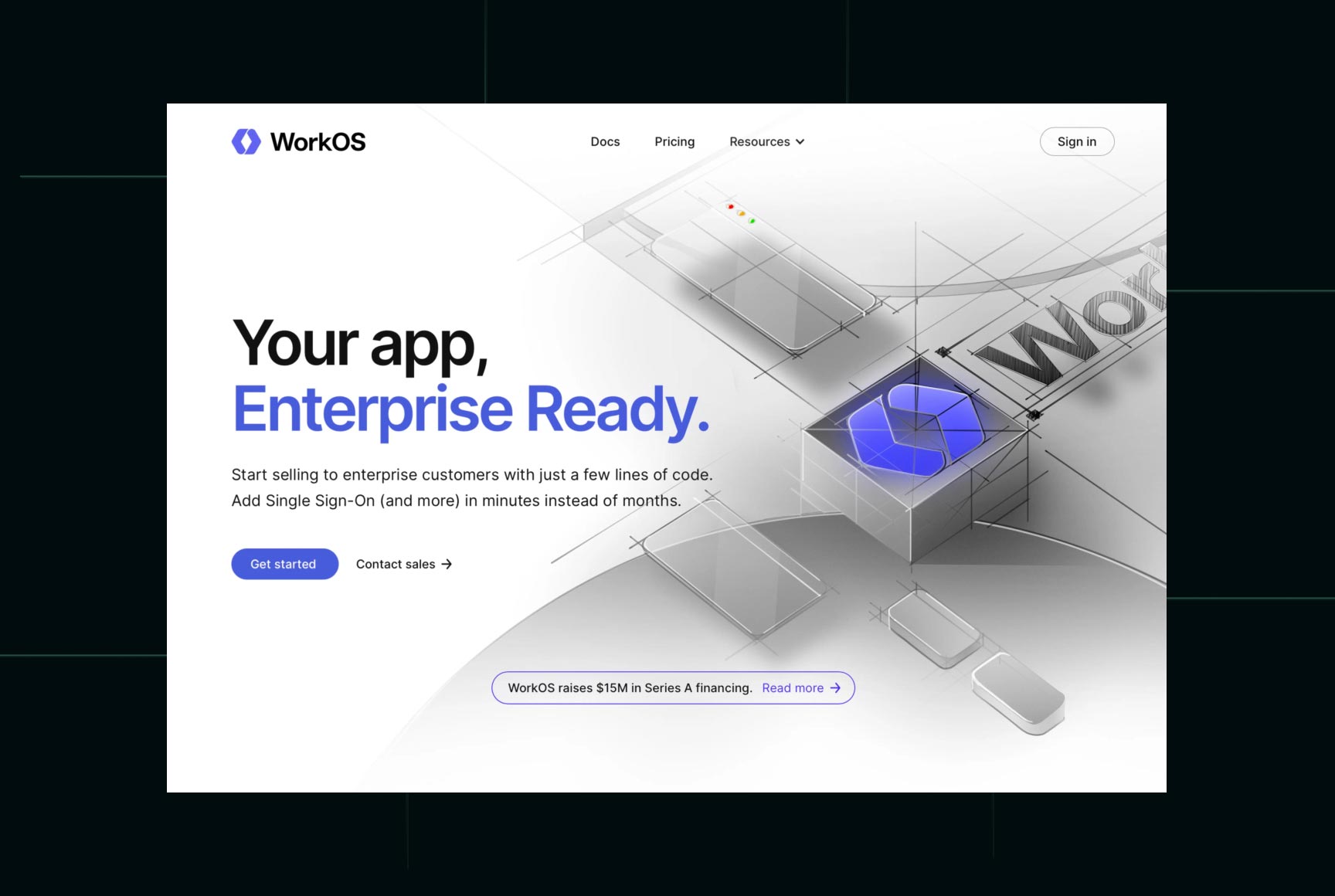
I spend a lot of time analyzing excellent websites, usually with one question in mind: "What would I improve?" WorkOS was frustrating for a different reason (On the UI Side) The more I explored it, the harder it became to find anything worth criticizing.
Score
- Visual Design: ★★★★★
- User Experience: ★★★★★
- SEO Structure: ★★★★☆
- Content Clarity: ★★★★★
- Overall: 9.8/10
What we'd take:
- Exceptional visual hierarchy
- World-class typography
- Minimal yet meaningful animations
- Consistent design language
- Focused messaging
What we'd improve:
Some feature explanations assume visitors already understand modern developer workflows. Adding a few more real-world use cases could help non-technical decision-makers.
What separates websites like WorkOS from everyone else?
It isn't the animations. It isn't the budget. It's strategy. Every page has a purpose before a designer places a single pixel (SEO & UX Research and great architecture), See How We Design SaaS Websites
2. Notion - One Product, Hundreds of Use Cases, One Simple Story
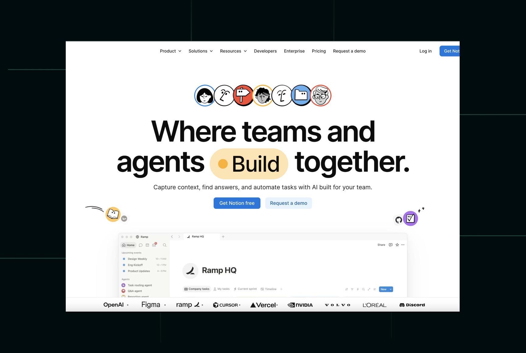
Imagine building a product used for note-taking, project management, documentation, AI, wikis, CRMs, knowledge bases, and team collaboration. Now explain all of that on a homepage without making visitors run away. The homepage never starts with features. It starts with possibility. Visitors immediately imagine how they could organize their own work before they're asked to learn the product. Most startups explain their software. Notion explains your life after using it.
Why Notion is one of the excellent websites
Despite offering dozens of products and hundreds of templates, navigation remains surprisingly approachable. Content is divided into logical categories. The homepage avoids becoming a feature dump. Instead, visitors naturally discover additional products through internal links and contextual recommendations.
Score
- Visual Design: ★★★★★
- User Experience: ★★★★★
- SEO Structure: ★★★★☆
- Content Clarity: ★★★★★
- Overall: 9.7/10
What we'd learn:
- Outstanding storytelling
- Brilliant content architecture
- SEO-friendly landing page strategy
- Excellent illustrations
- Product-led navigation
3. Framer - The Website That Became Its Own Best Advertisement
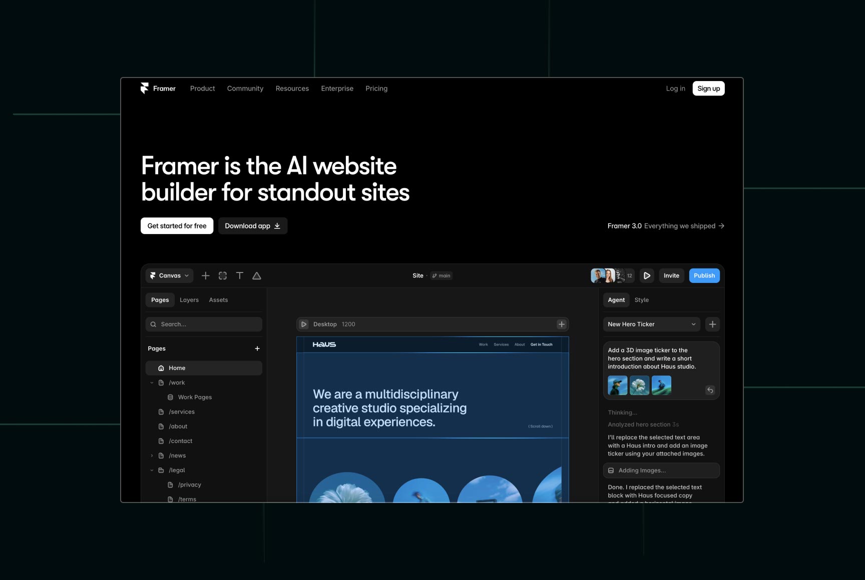
It sells a website builder. Its own website makes thousands of designers think, “I wish I had built this.” What makes Framer one of the most popular website designs? Motion. But not the kind that exists because someone discovered a new animation library. Every transition reinforces hierarchy, explains interactions, or guides visitors through the story. Why it's one of the excellent websites Framer also excels at demonstrating its product. Instead of writing paragraphs explaining what users can build, the website shows real examples throughout the experience.
What SaaS founders should learn
Show your product. Seriously. Too many startups hide screenshots until halfway down the homepage, as if their software is participating in witness protection. The most popular website designs reveal the product immediately because visuals build trust much faster than marketing copy.
Score
- Visual Design: ★★★★☆
- User Experience: ★★★★★
- SEO Structure: ★★★★☆
- Content Clarity: ★★★★★
- Overall: 9/10
What we'd take:
- Exceptional motion design
- Product-first storytelling
- Outstanding visual consistency
- Modern interactive experience
- Strong template showcase
What we'd improve:
Some animations can distract users on slower devices. Performance should always win over visual effects.
4. Vercel - The Definition of Developer-Focused Design
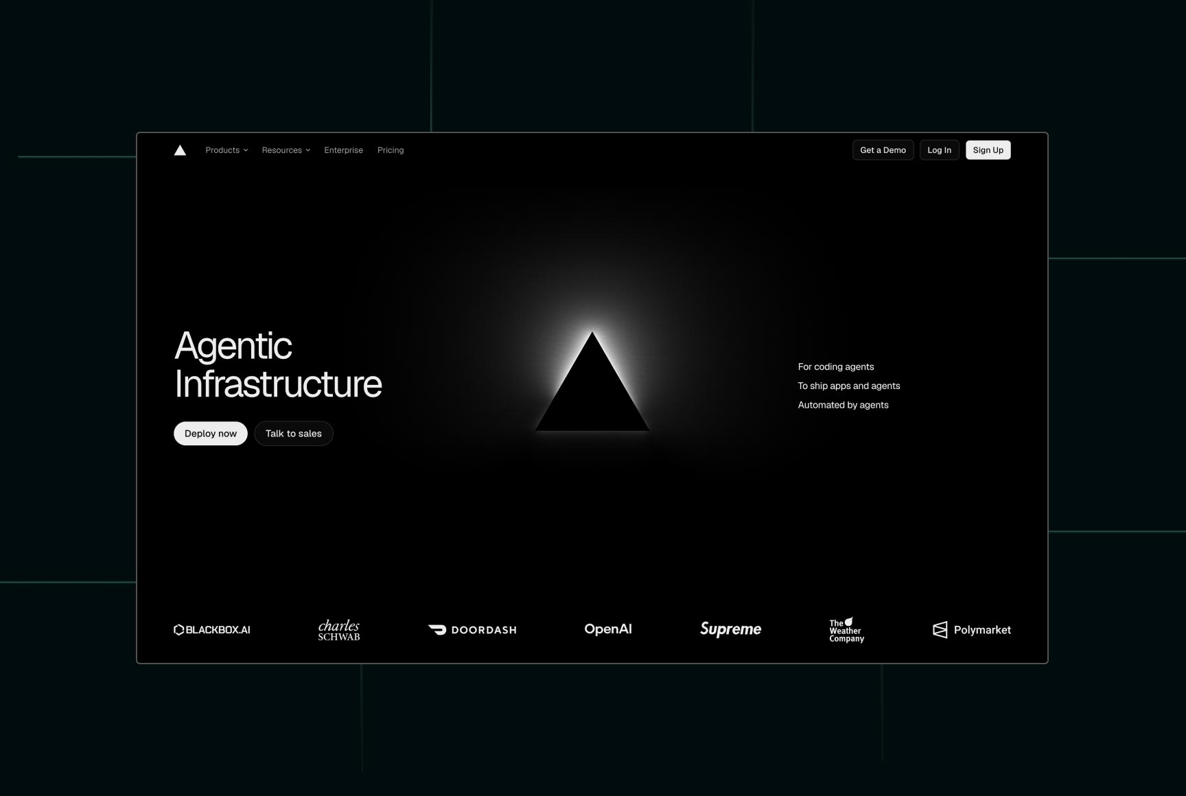
Every headline, illustration, code example, and feature explanation speaks directly to technical users without trying to dilute the message for everyone else. What makes Vercel one of the most popular website designs? Technical products often suffer from what we call the Curse of Knowledge - when experts assume everyone understands the same terminology they do. Vercel avoids this surprisingly well. Complex infrastructure concepts are supported by simple diagrams, clean layouts, and carefully prioritized information. Even non-engineers can understand the overall value proposition.
What SaaS founders should learn
Don't optimize your website for everyone. Optimize it for the people who actually buy your product. The most popular website designs feel personal because they're written for a specific audience - not for "everyone interested in digital innovation." That's not a customer segment.
UX Score
- Visual Design: ★★★★☆
- User Experience: ★★★★★
- SEO Structure: ★★★★★
- Content Clarity: ★★★★☆
- Overall: 9/10
What we'd learn:
- Audience-specific messaging
- Outstanding performance
- Excellent technical documentation
- Modern design system
- Clean product demonstrations
5. UNA Watch - A Product Website That Challenges an Entire Industry
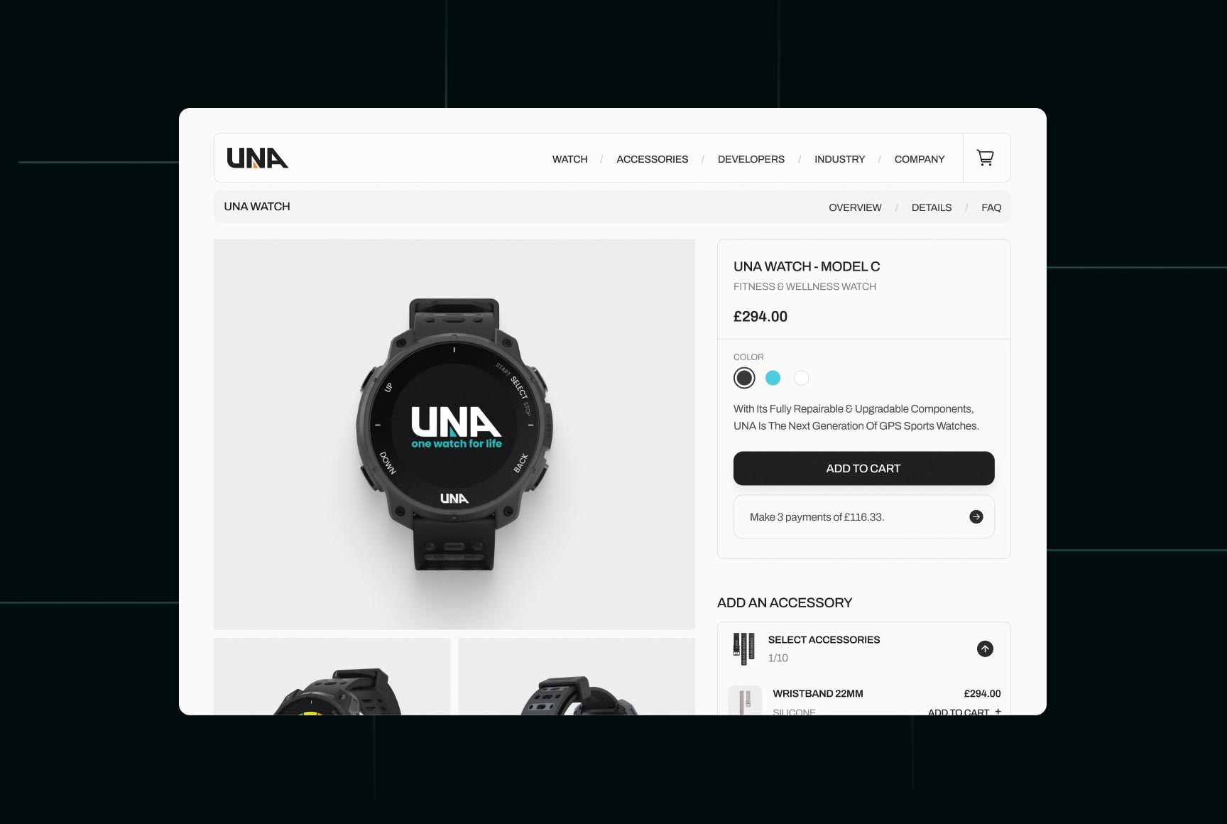
Instead of asking, "How can we make another smartwatch?", they asked a far more interesting question: "Why does a smartwatch have to become electronic waste after two or three years?"
That single idea shaped not only the product, but the entire website. It's one of the reasons we believe UNA deserves a place among the most popular website designs for startups in 2026.
What SaaS founders should learn
Your biggest competitive advantage shouldn't be hidden halfway down the homepage.
Score
- Visual Design: ★★★★★
- User Experience: ★★★★★
- Content Clarity: ★★★★★
- Storytelling: ★★★★★
- Performance: ★★★★☆
- Overall: 9/10
What we'd take:
- Clear value proposition from the first screen
- Product-first storytelling
- Strong visual hierarchy
- Consistent brand identity
- Excellent balance between technical depth and simplicity
What we'd improve:
As the product ecosystem grows, adding more interactive comparison tools and educational content could strengthen both SEO and long-tail conversion opportunities.
6. Dropbox - The Art of Making Complex Technology Feel Effortless
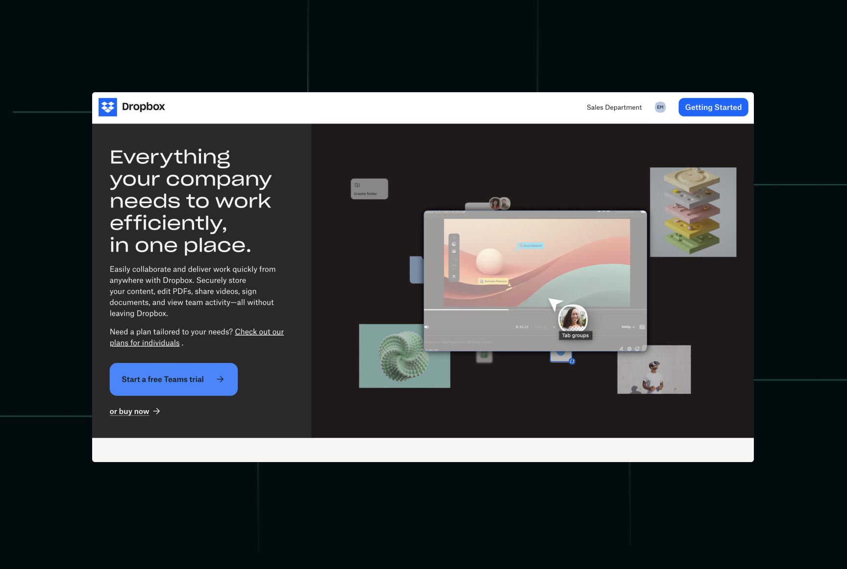
Cloud storage isn't exactly the most exciting product category. Let's be honest. Nobody wakes up thinking, "I can't wait to compare file synchronization platforms today." Yet Dropbox has remained one of the most popular website designs for years - not because it's flashy, but because it removes complexity from an inherently technical product.
What makes Dropbox one of the most popular website designs?
Dropbox follows one simple philosophy:
Show the result before explaining the technology.
What SaaS founders should learn
Ask yourself one question:
What job is your customer hiring your software to do?
Score
- Visual Design: ★★★★★
- User Experience: ★★★★★
- SEO Structure: ★★★★☆
- Content Clarity: ★★★★☆
- Overall: 8.5/10
What we'd take:
- Outcome-first messaging
- Excellent page hierarchy
- Minimalist interface
- Consistent visual language
- Strong onboarding flow
What we'd improve:
The homepage could showcase more real product interactions instead of relying primarily on illustrations and static imagery.
7. Clay - Proving That B2B Doesn't Have to Be Boring
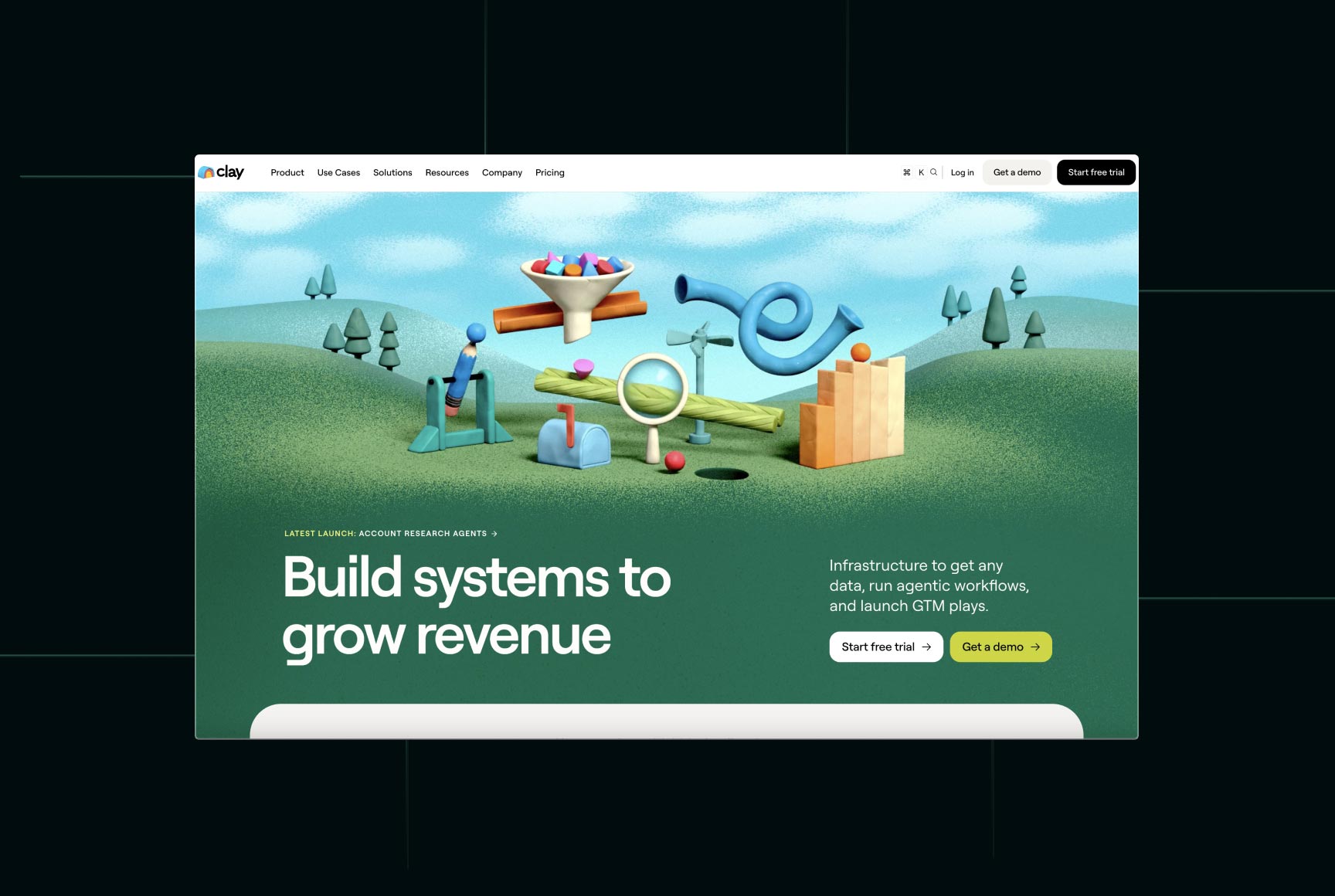
Instead of looking like another enterprise sales platform, Clay built one of the most popular website designs in modern SaaS by combining premium branding, exceptional typography, and product-first storytelling. You can tell right away from the design that their team includes bold people who are willing to make bold decisions-and in their case, it works.
Why it's one of the excellent websites
Clay strikes a difficult balance between enterprise credibility and startup personality.
What SaaS founders should learn
Websites on serious topics don't always have to be serious, but they should take their users' background into account.
Score
- Visual Design: ★★★★★
- User Experience: ★★★★★
- SEO Structure: ★★★★☆
- Content Clarity: ★★★★★
- Brand Identity: ★★★★★
- Overall: 9.8/10
What we'd take:
- Premium typography
- Product-first storytelling
- Excellent visual hierarchy
- Strong brand personality
- Clean conversion flow
What we'd improve:
The platform has an enormous feature set, and some advanced capabilities could be surfaced earlier for power users without overwhelming first-time visitors. I think Clay fits this list much better than Mercury—it feels genuinely influential, modern, and is the kind of website many SaaS startups are trying to emulate today.
8. Ramp - A Beautiful and Harmonious Design
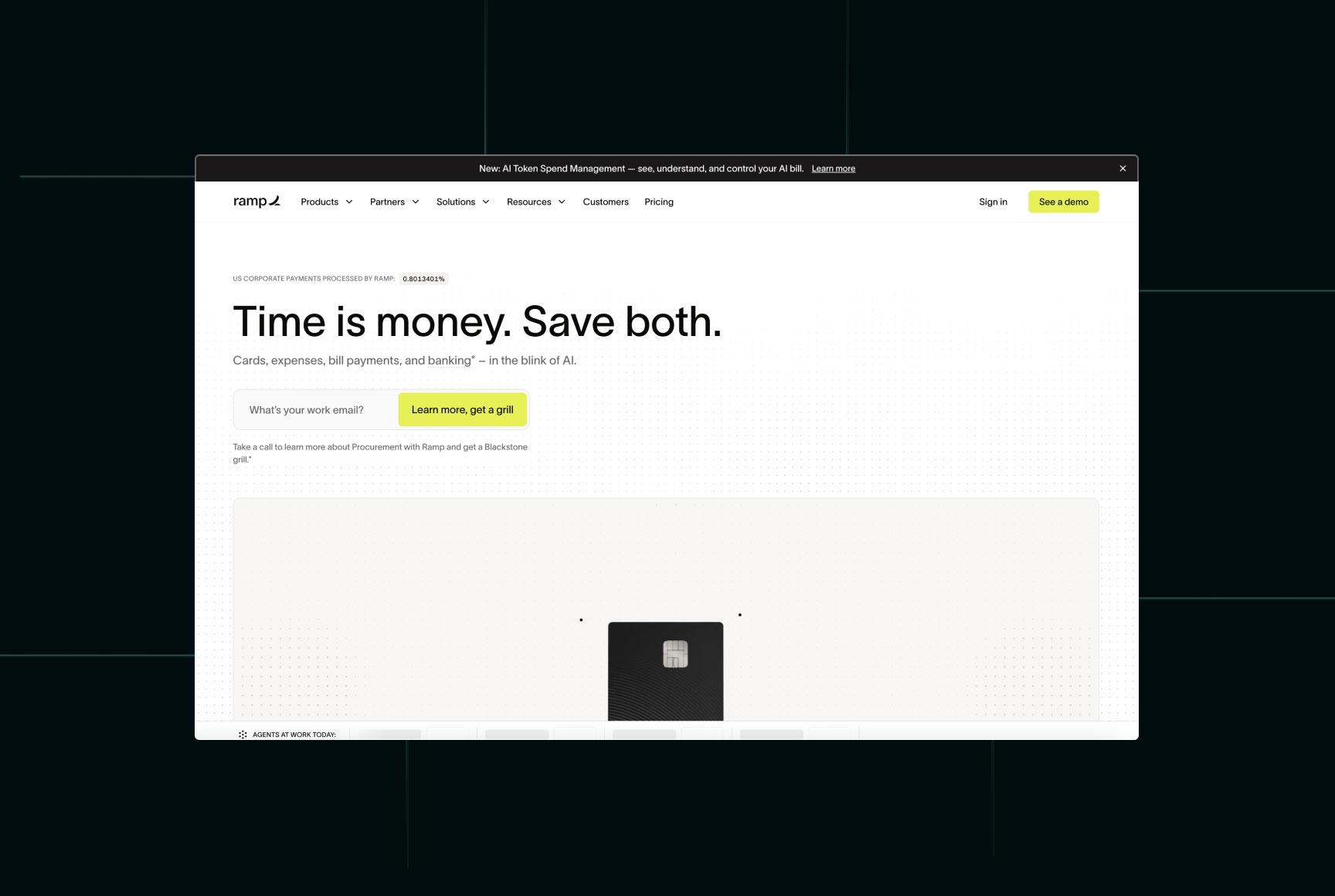
Finance software usually follows one of two design philosophies. Either it looks too corporate. Or it looks so futuristic that you're not entirely sure whether it's a banking platform or the trailer for a sci-fi movie.
What makes Ramp one of the cool?
Ramp excels at content hierarchy. Rather than introducing dozens of products simultaneously, the homepage presents one idea at a time. Expense management, corporate cards, accounting automation, procurement, and travel all receive dedicated sections with clear explanations and relevant product visuals. The pacing feels intentional. Visitors never feel overwhelmed, despite the platform offering an enormous feature set. This is an excellent example of Content Prioritization - showing users exactly what they need at each stage of their journey instead of exposing every feature at once.
Score
- Visual Design: ★★★★★
- User Experience: ★★★★★
- SEO Structure: ★★★★★
- Content Clarity: ★★★★★
- Overall: 9.8/10
Pros:
- Excellent content hierarchy
- Outstanding product screenshots
- Benefit-driven copywriting
- Consistent design system
- Strong conversion-focused layout
What we'd improve:
For some reason, it’s not that optimised, probably because of the CMS They used, And sometimes they use too much of white space (I personally not a fan of super minimalistic design)
9. GSAP - The Science Behind Smooth User Experiences
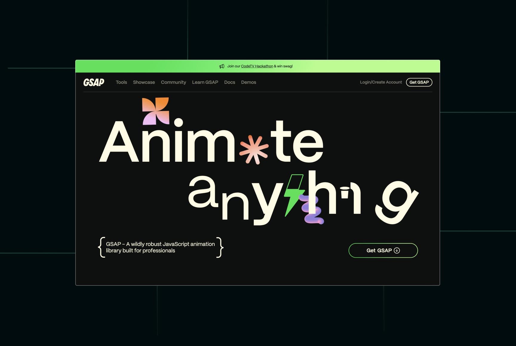
GSAP (GreenSock Animation Platform) gave developers the tools to create animations that improve storytelling, usability, and interaction. That's why its own website deserves a place among the most popular website designs.
Why it's one of the excellent websites
GSAP manages something surprisingly difficult. It showcases incredibly advanced animation while keeping the interface clean and easy to navigate.
What SaaS founders should learn
Animation should answer one question: "Does this help the user?"
Score
- Visual Design: ★★★★★
- User Experience: ★★★★★
- Motion Design: ★★★★★
- Performance: ★★★★★
- Overall: 9.9/10
What we'd learn:
- Purpose-driven animations
- Scroll-based storytelling
- Exceptional interaction design
- Smooth performance
- World-class motion principles
10. GitHub - The Website Every Developer Trusts
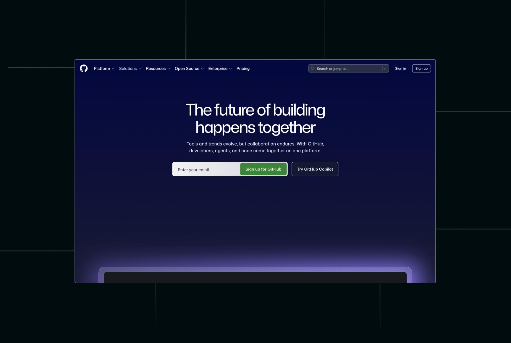
Created by talented designers - I personally love the style and design approach; every page is a surprise, and the graphic design is top-notch.
Score
- Visual Design: ★★★★★
- User Experience: ★★★★★
- Documentation: ★★★★★
- Developer Experience: ★★★★★
- Overall: 9.9/10
What we'd take:
- World-class documentation
- Exceptional information architecture
- Consistent design system
- Clear product segmentation
- Outstanding developer experience
Honor mentiones
Not every most popular website design needs a full breakdown to deserve recognition. These excellent websites consistently push UX, branding, motion design, and performance forward, making them fantastic sources of inspiration for startups and SaaS founders.
- ElevenLabs Stunning product presentation, polished interactions, and one of the strongest AI websites today. (I'd really appreciate it if they stopped spamming my inbox, though. ⭐)
- Apple The gold standard for product storytelling, visual hierarchy, and launch pages.
- Nucleo Clean, elegant design with exceptional typography and attention to detail.
- Linear A masterclass in minimalism. I absolutely love this style of clean, focused SaaS design.
- Contiant A serious industry presented with bold branding and a confident visual identity.
- Runway Both the previous and current versions of the website are outstanding examples of modern product marketing.
- ArtMoney Surprisingly human-centered UX with the kind of minimalism that prioritizes usability over decoration.
- Companies.tools Clean directory design with excellent organization and an intuitive browsing experience.
- Twingate Strong visual identity, premium branding, and excellent product storytelling.
- Stripe As always, one of the industry's benchmarks for SaaS websites, motion design, and conversion-focused UX.
Great Websites Aren't Built by Accident
Every layout, headline, interaction, and button exists for a reason. They communicate value clearly, guide visitors naturally, and make complex products feel simple. That's what separates truly excellent websites from the thousands of lookalike templates appearing online every day.
Ironically, AI has made great design even more valuable. It has become incredibly easy to launch a website in a weekend. It has become much harder to build one that earns trust, ranks on Google, and consistently converts visitors into customers.

_11zon_3i6y1bgme8ccwfz.webp)