Short answer: Minimalism took over SaaS design for good reason, but “clean” too often became “cryptic,” with interfaces hiding the very controls users need. The future is not less minimalis - it is minimalism with functionality. Keep the calm surface, but make actions discoverable. Simplicity should mean clarity, not silence.
The Future of SaaS Design: When Minimalism Becomes Confusion
Minimalism took over SaaS design, and mostly for good reason. But somewhere along the way, "clean" started to mean "cryptic," and interfaces began hiding the very things users need. Let us address the elephant in the room, the one nobody can see because it is probably tucked behind a hamburger menu. This is about where minimalism helps, where it quietly sabotages your product, and how to get the clean look without the confusion.
Many designers also use "minimalism" as an excuse for poor UX, defending missing labels, hidden navigation, and weak visual hierarchy as intentional simplicity rather than flawed design.
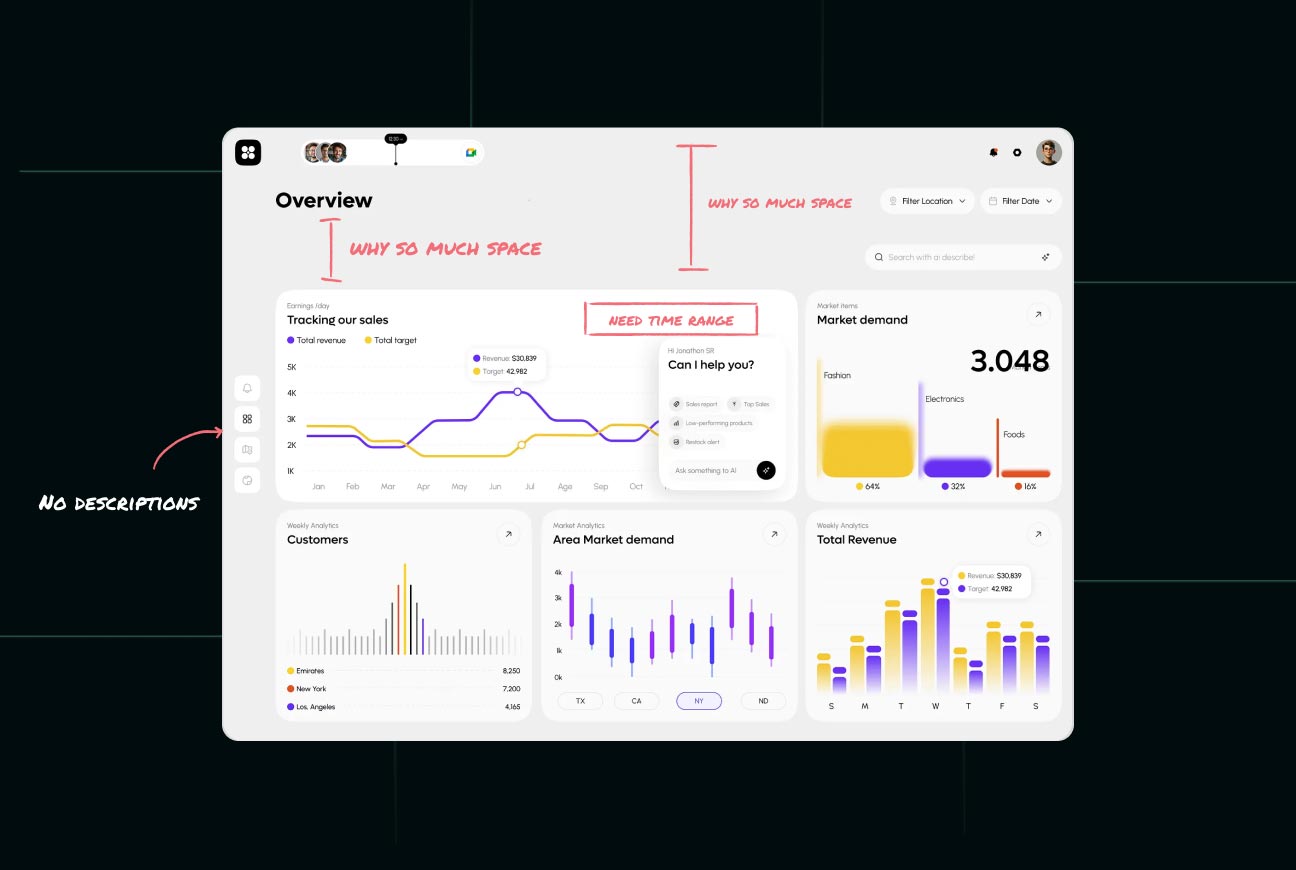
The Disappearing Interface Phenomenon
Buttons Should Not Be an Easter Egg Hunt
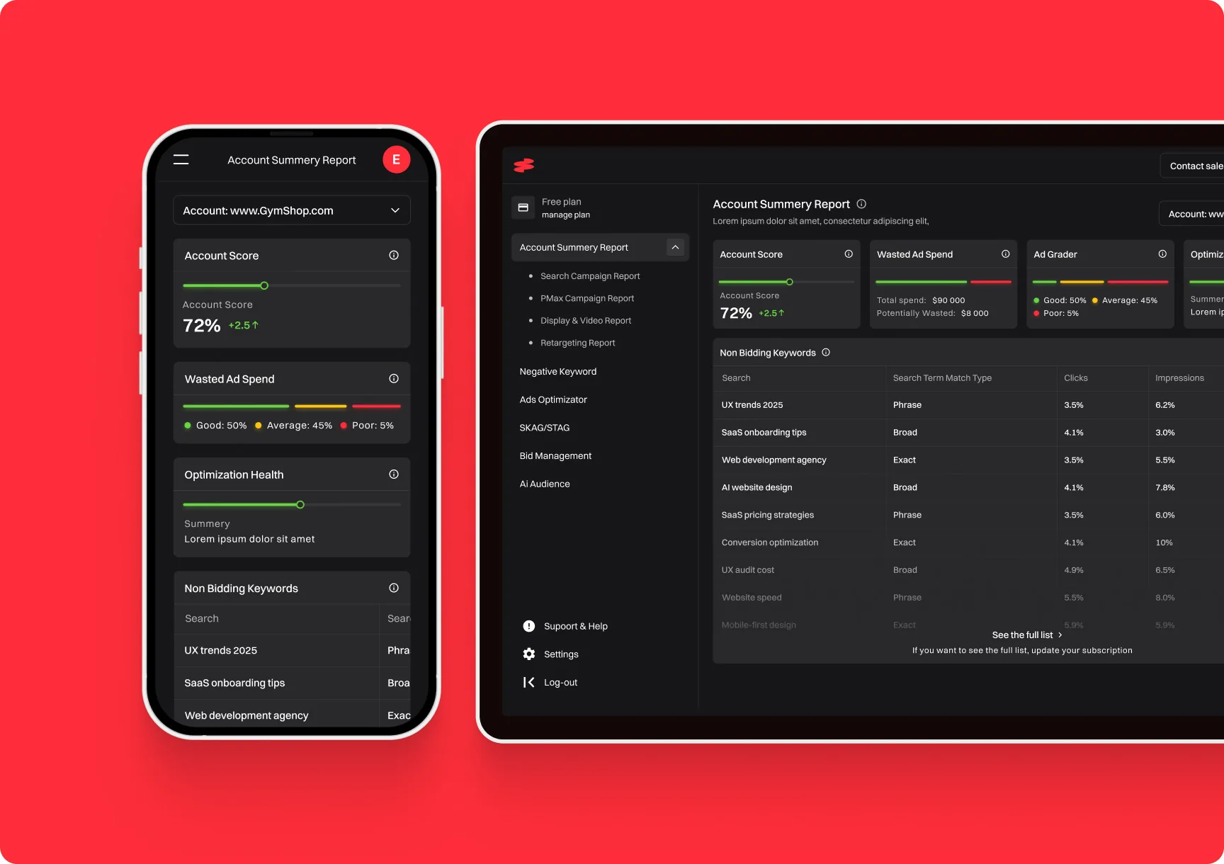
Users do not want to feel like they are cracking a code just to export a PDF. Yet in the name of minimalism, interfaces have become cryptic puzzles. Icons float without labels, actions hide behind mystery gestures, and screens look beautifully clean while users feel completely lost. Removing a button does not simplify a product if it just means users cannot find the function anymore, it relocates the complexity from the screen into the user's frustration.
Clarity Is Not a Crime
Somewhere, "minimal" got confused with "label-free." One of our clients once asked us to "remove the clutter" from their dashboard, which translated to deleting all the labels and trusting users' psychic abilities to figure things out. We did not. Clarity is not clutter. A clear label, a visible button, an obvious next step, these are not aesthetic failures, they are the entire point of an interface. Minimalism should remove the unnecessary, not the necessary.
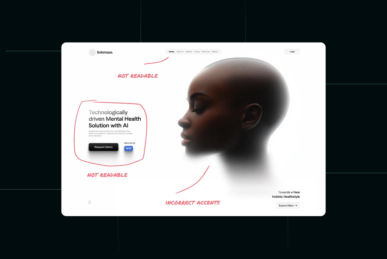
A Pretty Interface That No One Understands
The Myth of "Intuitive by Default"
There is a comforting belief among designers that a clean interface is automatically intuitive. It is not. Intuitive means a user can figure out what to do without being taught, and a stripped-back screen full of unlabeled icons is often the opposite of that. Beauty and usability are related but not the same, and prioritizing the look over the understanding produces interfaces that win design awards and lose users.
See What "Clean Without Confusion" Looks Like
If You Have to Explain It, It's Not Intuitive
Here is a simple test. If your onboarding has to teach users where the basic functions are, the interface is not intuitive, no matter how elegant it looks. A truly intuitive design needs little explanation because the next step is always visible and obvious. When teams find themselves adding tooltips and tutorials to explain a minimal interface, that is a sign minimalism went too far and started hiding things users genuinely need.
Minimalism vs Functionality: Choose Both
The false choice at the heart of this is treating minimalism and functionality as opposites, where every label removed is a win for clean design. They are not opposites. The best SaaS design achieves both: a calm, uncluttered look and complete, obvious functionality. The skill is removing genuine noise, redundant elements, decorative clutter, unnecessary steps, while keeping every signpost a user relies on.
This is harder than pure minimalism, because it requires understanding what users actually need rather than just deleting until the screen looks sparse. But it is the only kind of minimalism worth having. A clean interface that still tells users exactly what to do is the real goal, not a beautiful screen that leaves them guessing. This balance matters across every industry, from consumer tools to complex fintech platforms where confusion carries real cost.
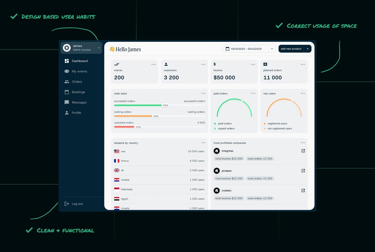
What Actually Works (and Still Looks Good)
Practical, clean design that stays usable follows a few principles. Use icons with labels, not icons alone, since an icon's meaning is rarely as obvious to users as it is to the designer. Keep primary actions visible rather than buried in menus, so the most common tasks are always one click away. Use whitespace to create calm, not to hide functionality. And test with real users, because the gap between "looks clean to the team" and "makes sense to a newcomer" is where most minimal interfaces fail.
The throughline is empathy for the user over admiration from other designers. A design that quietly helps a confused first-time user succeed is worth more than one that impresses your peers and frustrates your customers. Clean and clear are not enemies, but keeping them together takes deliberate effort.
How Minimalism Went Wrong
It is worth understanding how a genuinely good idea curdled into a problem. Minimalism became popular because early software was cluttered, overwhelming, and ugly, and stripping things back genuinely improved it. But the lesson got over-applied. Designers started treating removal itself as the goal, as if fewer elements always meant better design, regardless of whether users could still accomplish their tasks.
The result is a kind of cargo-cult minimalism: copying the sparse look of admired products without the careful thinking that made those products actually usable. The clean interfaces people admire are usually the result of enormous effort to keep things clear while removing clutter, not the result of simply deleting labels. Mistaking the appearance of simplicity for the substance of it is how minimalism turned from a fix into a fresh source of confusion.
The Cost of Getting This Wrong
When minimalism tips into confusion, the damage shows up in the numbers that matter. Users who cannot find a feature do not file a tidy bug report, they just use the product less, get less value, and eventually churn. Onboarding gets longer because the interface needs explaining. Support tickets rise for things that should be self-evident. And the trial-to-paid conversion quietly suffers because new users never reach the moment where the product proves its worth.
The cruel part is that these costs hide behind a beautiful interface that everyone on the team admires. The design looks like a success in internal reviews and fails quietly with real users. That gap between how a design looks to its makers and how it works for newcomers is exactly where confused minimalism does its damage, which is why testing with real first-time users matters more than any amount of in-house admiration.
Final Thoughts: Simplicity Is Not Silence
The future of good SaaS design is not more minimalism for its own sake, it is smarter minimalism that serves users instead of hiding from them. Simplicity should mean removing what gets in the way, not removing the help people need. An interface can be beautiful and obvious at the same time, and that combination, not stark emptiness, is the real mark of mature design. Strip away the noise, keep the signposts, and remember that the cleanest interface in the world is worthless if nobody can figure out how to use it. Simplicity is clarity, not silence.