Small UI Tweaks That Make Users Feel in Control
The difference between a product people trust and one they quietly abandon often comes down to tiny details, the small UI tweaks that make users feel in control rather than at the mercy of the interface. None of these are glamorous redesigns. They are minor, almost invisible improvements that add up to an experience where users feel confident instead of anxious. Here are the ones that punch far above their weight.
Make Buttons Look Clickable (Apparently Not Obvious Anymore)
It needs saying: if it is a button, it should behave like one. In the rush toward minimalism, plenty of interfaces have buttons so flat and unstyled that users genuinely cannot tell what is clickable. A button that does not look like a button is a riddle, not a control.
How to Fix It
- Add clear hover effects, so users get confirmation their cursor is not broken
- Use real contrast and padding, because gray text in a ghost button is a puzzle, not a design
- Make sure the button actually does something visible, since nothing frustrates like clicking and seeing no response
Undo and Confirmations: Saving Users From Their Own Regrets
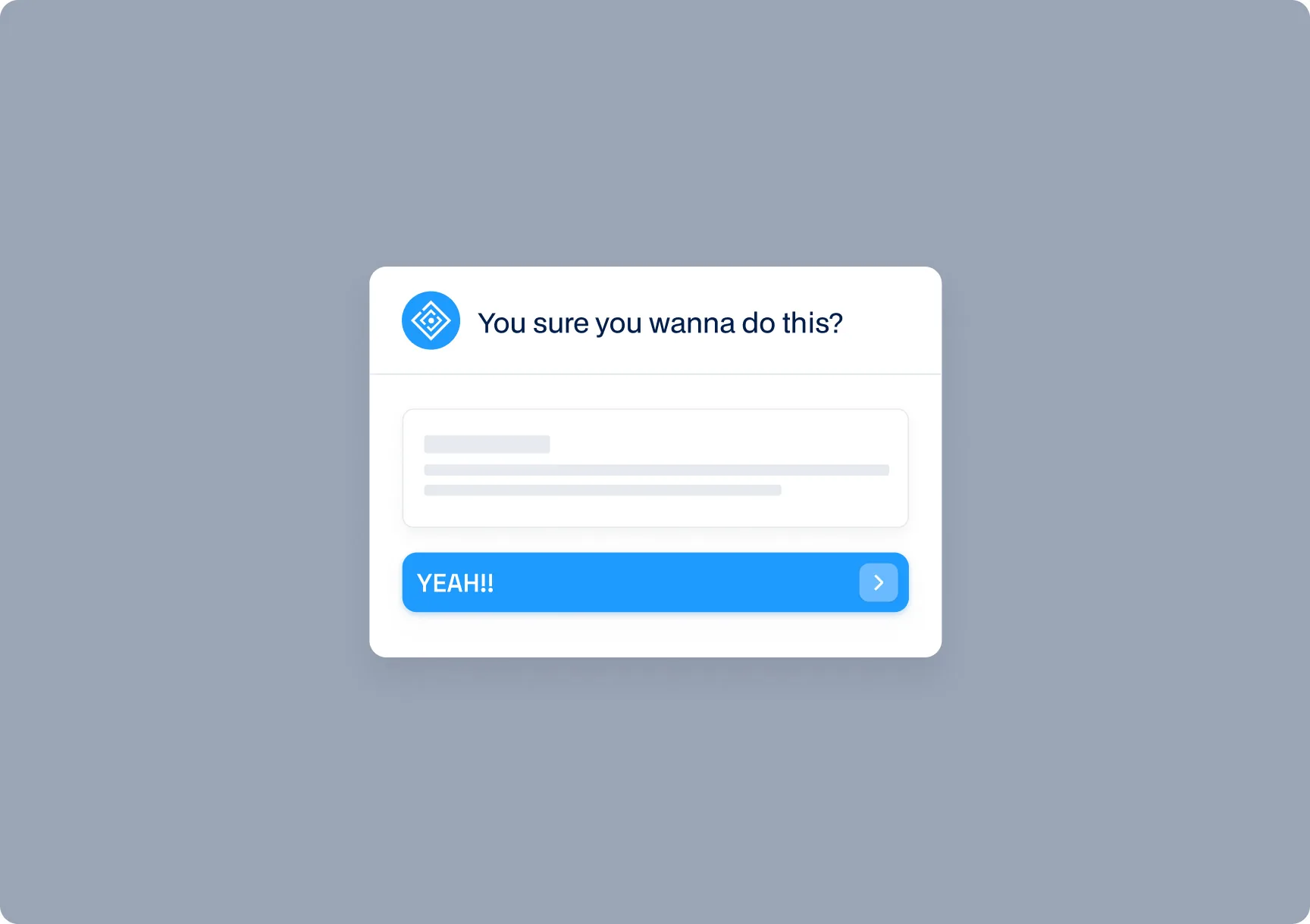
People make mistakes, and an interface that punishes those mistakes feels hostile. The ability to undo an action, or a gentle confirmation before something irreversible, gives users the confidence to explore without fear. Confidence to act is the foundation of feeling in control.
How to Fix It
- Offer undo for destructive actions instead of an immediate, permanent delete
- Add confirmation prompts for the truly irreversible, but do not over-use them on trivial actions
- Make the safe path obvious, so users never feel one wrong click away from disaster
Default Settings That Don't Assume Users Are Psychic
Good defaults are an invisible gift. When the most sensible option is already selected, users get a working experience without having to configure anything, and they feel guided rather than abandoned. Bad defaults, or no defaults, force people to guess at choices they do not yet understand.
How to Fix It
- Set the most common, sensible option as the default so the product works out of the box
- Make settings easy to change for those who want to, without requiring it from those who do not
- Avoid forcing decisions on users before they have enough context to make them
Loading States That Don't Feel Like a Black Hole
When something takes time, silence is the enemy. A blank screen or a frozen button leaves users wondering whether the app is working or broken, and that uncertainty is deeply uncomfortable. A good loading state communicates that something is happening and they have not been forgotten.
How to Fix It
- Show a loading indicator, spinner, progress bar, or skeleton screen, so users know the app is working
- For longer operations, give a sense of progress rather than an endless spinner
- Disable the button after a click so users do not anxiously click again, unsure if it registered
Auto-Save: Because Nobody Likes Losing Work
Few things destroy trust faster than losing work to a crash, a misclick, or a closed tab. Auto-save quietly protects users from those disasters, and the peace of mind it provides is enormous. Users may never consciously notice it, but they will absolutely notice its absence the first time they lose something.
How to Fix It
- Auto-save work in the background at sensible intervals
- Show a subtle indicator that work has been saved, so users feel secure
- Preserve unsaved state across sessions where possible, so a closed tab is not a catastrophe
Search That Actually Finds Things
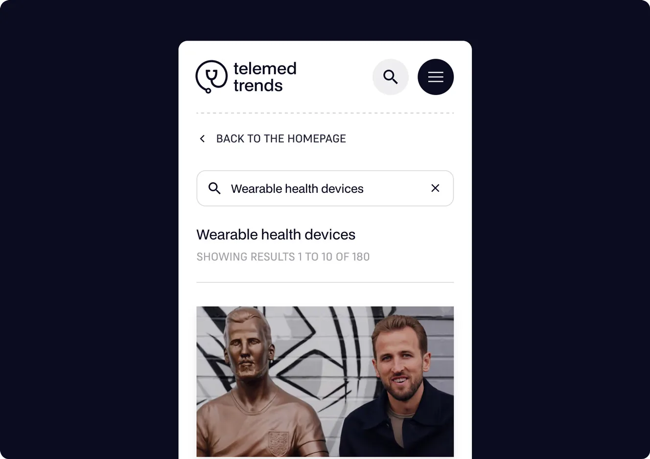
When a product has any real depth, search becomes how users navigate, and search that fails them is profoundly frustrating. Search that forgives typos, understands partial terms, and surfaces relevant results quickly makes users feel powerful. Search that demands exact phrasing makes them feel stupid, which is the opposite of in control.
How to Fix It
- Make search forgiving of typos and partial matches rather than demanding precision
- Show results fast, ideally as the user types
- Surface the most relevant results first instead of a raw, unranked list
Personalization That Isn't Creepy
Thoughtful personalization makes users feel the product understands them. The trick is staying on the right side of helpful, surfacing what they use, remembering their preferences, without veering into the unsettling territory of knowing too much. Good personalization feels like a helpful assistant, not surveillance.
How to Fix It
- Remember user preferences and recent actions to reduce repeated effort
- Surface relevant features based on real usage, not invasive tracking
- Keep personalization transparent and in the user's control, never creepy or opaque
Why These Small Tweaks Matter So Much
Individually, none of these changes is dramatic. Collectively, they transform how a product feels. Each one removes a tiny moment of doubt, friction, or anxiety, and replaces it with a small moment of confidence. Multiply that across every interaction, every day, and you get the difference between a product users tolerate and one they genuinely trust. Control is largely a feeling, and these tweaks are how you create it.
The best part is the return on effort. These are not expensive redesigns, they are small, targeted improvements that any team can ship incrementally. Yet their cumulative effect on retention, satisfaction, and word of mouth is outsized, because feeling in control is exactly what keeps people coming back to a tool they pay for.
The Psychology Behind Feeling in Control
There is real psychology behind why these tweaks matter so much. Humans are deeply uncomfortable with uncertainty, and a confusing interface generates a low hum of anxiety with every interaction: did that save, will this delete everything, why is nothing happening. Each small UI improvement removes one of those uncertainties, and the cumulative effect is a user who feels calm and competent rather than tense and second-guessing.
That feeling of competence is what builds loyalty. People return to tools that make them feel capable and avoid ones that make them feel stupid, regardless of the underlying features. This is why two products with identical functionality can have wildly different retention: one sweats these details and one does not. Feeling in control is not a soft nicety, it is a measurable driver of whether users stay.
Final Thoughts: Control Is an Illusion, but a Lucrative One
Users never have complete control over your software, and they do not need to. What they need is to feel in control, confident that they understand what is happening, that mistakes are recoverable, and that the product is working with them rather than against them. These small UI tweaks create exactly that feeling, and that feeling is what turns a trial into a subscription and a user into an advocate. Sweat the small stuff, because in UX the small stuff is where trust is quietly won or lost.