

Short answer: Stripe's website is the result of great product engineering. Behind its polished UI is a well-planned information architecture, SEO-optimized content, high-performance front-end, and scalable backend, all working together to create one of the best SaaS websites on the web.
Stripe Website Design: Why Your Startup Deserves More Than a Pretty Button
As a UX/UI designer, I have had at least 94 conversations that began with “We want something clean but also playful but also very corporate but also fun.”. So here is your reality check: what you like is not the same as what your target audience needs.
Stripe website design is not about decorating your homepage with trendy gradients and a Lottie animation of a flying raccoon (but they've got lottie as well). It is about strategy, great & simple architecture and UI Designed for their users. Get those right, and the polish takes care of itself. Get them wrong, and no amount of animation will save the page.
Where Do You Even Look?
Welcome to the jungle. Let us break down the places where founders, and their junior designers, get lost while hunting for Stripe website design inspiration. (These spots are for UI inspiration)
1. Dribbble
Ah, Dribbble, where dreams go to die under the weight of over-designed, totally unusable concept shots. What to like here: clean typography, interesting use of space, bold color. What to ignore: fake dashboards at 5% opacity, buttons that look sculpted in marble, and "case studies" that are three images and zero strategy. It is a great mood board and a terrible blueprint.
2. Behance
Behance is where everyone becomes a philosopher, and suddenly every project is "a study of light and user perception across digital ecosystems." What to like: full website flows, animations shown in context, and real breakdowns of UX decisions. What to ignore: endless branding mockups on coffee cups, because no one will ever drink from a mug with your dashboard printed on it. You can find Stripe website design here that actually had a brief behind it, but always ask the key question, did it ship?
3. Awwwards
Home of the "most likely to kill your SEO" awards. What to like: out-of-the-box ideas, visual drama, and bold layout experiments. What to ignore: nearly all of it if your real goals are performance, SEO, and accessibility. If you sell accounting software for logistics companies and pick a reference full of 3D floating jellyfish, congratulations, you have just made your investors nervous. Used with restraint, though, Awwwards is a good place to see how not to look boring.
4. Your Own Industry
Here is a radical idea: look at your competitors. Really look. Check what their websites do, analyze what is working, and make a list. See where they get their traffic and study their landing page structure, not just their hero image. Because while everyone wants to stand out, nobody wants to stand out like a clown at a funeral. Your industry is often the most useful and most ignored source of inspiration you have.
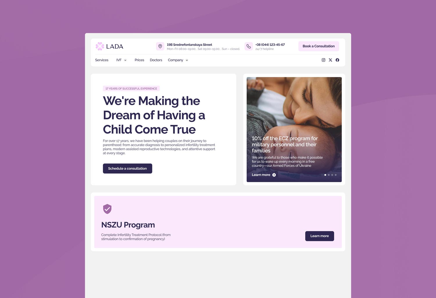
That's our work btw (In their case, more than 50% of clients come from SEO on their website)
How to Look (Without Losing Your Mind)
Now that you have bookmarked every website with a gradient and a parallax scroll, let us talk about how to actually look at them.
1. Strategy First, Aesthetics Second
If your goal with Stripe-style website design is conversion or SEO visibility, please do not ask your designer for a full-screen WebGL video of a dolphin doing backflips. You are not building a museum, you are building a machine. Ask yourself the questions that matter: Do I need fast loading? Will this work on mobile? Can a confused person understand what I am selling in five seconds? If the design does not serve those answers, it is decoration, not strategy.
2. What to Actually Pay Attention To
You love bright, bubbly colors and confetti animations. Great, but you sell enterprise compliance tools, so let us talk. Website design must serve your users, not your aesthetic preferences. Pay attention to structure, how information is layered and whether the user is gently guided or thrown into a pit of tabs. Watch the messaging hierarchy, what you read first and whether it is useful or poetic nonsense. And study interaction, whether users can tell what is clickable or everything wiggles like it is alive. Even "fun" can be structured; a stripey site does not have to mean chaos.
3. Don't Just Copy, Understand
Just because Stripe has become the golden calf of modern website design does not mean cloning it makes sense. Stripe's site works because it reflects their scale, simplicity, and engineering-driven ethos. You, on the other hand, might need a bit more warmth, a clearer call to action, and a more explicit explanation of what you do, because you are not yet a household name and cannot assume people already understand the product. Understand why a reference works before you borrow from it.
4. Show the Vibe, Not the Blueprint
Here is a golden rule of good design: show your designer what you like, but do not tell them how to do it. Want to share a reference? Great, screenshot that pricing table, send the product card with the nice hover state, circle the headline you loved. But the moment you say "just copy this but make it different" or "exactly like this, but with our logo," you have crossed into UX micromanagement, and no one returns from there with dignity intact.
Designers are like chefs. Show them the ingredients you enjoy, bold fonts, clean layout, animated but subtle, and let them cook. Do not stand behind them yelling to use more garlic and fewer div blocks. Your job is to explain the vibe and the business goals. Their job is to translate that into a coherent, functional design that feels Stripe-clean but is uniquely yours. If you are hiring a designer just to move pixels according to your gut, you do not need a designer, you need a different conversation.
Your Stripe Website Is Never "Finished"
A beautiful website alone won't generate a steady flow of leads. If you want your website to become a long-term growth asset, it needs continuous optimization backed by data (google analytics could work, in our case we use analytics we developed ourselfs because it's way more accurate + we offer same to our clients) To build sustainable organic traffic and increase conversions, focus on:
- Earn high-quality backlinks to build domain authority and improve search rankings.
- Publish SEO-optimized content that answers the questions your potential customers are already searching for.
- Continuously improve your website using analytics, heatmaps, and user behavior data to identify friction, test new ideas, and increase conversions over time.
A Few Harsh but Loving Truths From Experience
Some things are worth saying plainly. The Website design you dream of will not work if you sell CRM to dentists and it takes eight seconds to load on 4G. Not every reference is a good one, some are just pretty lies. And you do not need 40 pages of visual concepts, you need one that actually speaks to your user. Here is what I tell my clients:
"It's not about being original. It's about being clear, intentional, and memorable for the right reasons."
And if that means ditching the neon type-on-noise background for a clean, purposeful layout, do it. You will still look good, just good in a way that makes people pay you.
Final Thoughts: Build Stripey, but Make It Smart
Stripe website design it's about clarity. It is about aligning design with business, not with your Pinterest board. It is about talking to your market, not to your inner creative genius or your designer's inner art student. In a world full of pretty websites that do not convert, you stand out by building one that actually works. The best compliment a startup site can earn is not "wow, that's beautiful," it is "oh, I get exactly what they do and I want it." Chase that reaction, not the design-award one, and you will end up with something far more valuable than a screenshot worth posting. And if you need help getting there, you know where to find us.


_3i6ymkeomclke0w7.webp)
_11zon_3i6yt30bmd5jrv06.webp)
