
_3i6ymkeomclke0w7.webp)
How We Built a "Perfect UI" for an Enterprise AI Product
"Perfect UI" is one of those phrases that means everything and nothing, until you have to actually deliver it for a real, complex product with demanding clients. This is the story of how we approached perfect UI for an AI-powered chatbot platform built for serious B2B integrations, what perfect actually meant in that context, and the lessons that apply to any team chasing a genuinely great interface.
Define "Perfect UI" Without Causing a Team Breakdown
Before anyone opens Figma, you have to answer one question that prevents endless arguments later: what does a perfect UI look like for this specific product? Perfect is not universal. We were not designing a dating app or a flashy crypto dashboard. This was an AI-powered chatbot product built for massive B2B integrations across industries, enterprise insurance brokers, logistics platforms, legal firms, the kind of clients who still call things "intranets" and mean it.
For that audience, perfect UI does not mean trendy or playful. It means trustworthy, clear, and efficient, an interface that serious professionals can rely on without a learning curve. Defining perfect in terms of the actual users and their context, rather than abstract aesthetics, is what kept the whole project aligned. Skip this step and every design review becomes a clash of personal taste with no way to settle it.
Competitor Analysis, or "Borrowing From the Best"
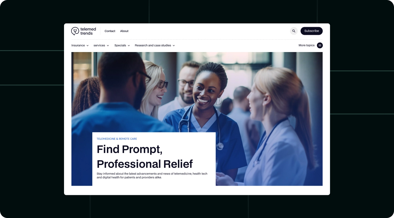
Smart design does not happen in a vacuum. Before designing, we studied the competitors and adjacent products our client's users already knew, not to copy them, but to understand the conventions those users expected. When your audience is enterprise professionals, familiarity is a feature. An interface that respects the patterns they already know reduces friction and builds trust faster than novelty for its own sake.
The goal of competitor analysis is to learn what works and what to avoid, then improve on it. We catalogued the smart choices worth adopting and the clumsy ones worth fixing, which gave us a clear map of where we could meet expectations and where we could genuinely do better. Borrowing from the best is not unoriginal, it is how you avoid relearning lessons the whole industry already paid for.
The Design Dance: One Figma File to Rule Them All
With the definition and research in hand, the actual design work began, and here discipline matters. A complex enterprise product generates a lot of screens, states, and components, and without organization that becomes chaos fast. We built around a single, well-structured Figma file with a real design system, shared components, consistent styles, and clear naming, so the interface stayed coherent as it grew.
This is the unglamorous backbone of a perfect UI. A design system means every button, input, and pattern behaves consistently across the whole product, so users learn it once and apply it everywhere. It also means designers and developers speak the same language, which prevents the gap between the mockup and the shipped product where so much quality quietly leaks away.
Frontend Development: Where Dreams Go to Die (or Get Shipped)
A perfect design is worthless if it ships as a degraded approximation. The frontend development stage is where many beautiful designs quietly die, losing detail, spacing, and polish in translation to code. Avoiding that requires designers and developers working closely, with the design system as the shared contract that keeps the build faithful to the intent.
For an enterprise product, the frontend also has to be fast and reliable, not just pretty. Performance, accessibility, and handling the many real-world states, loading, errors, empty states, edge cases, are what separate a demo from a product professionals trust daily. Perfect UI is as much about the unglamorous states as the hero screen, because real users spend most of their time in the former.
The Numbers: What Does "Perfect UI" Actually Deliver?
A perfect UI is not an aesthetic indulgence, it is a business investment, and it shows up in the metrics. A clear, trustworthy, efficient interface drives faster user adoption, smoother onboarding, fewer support requests, and higher satisfaction among demanding enterprise clients. For a B2B product where decisions involve long sales cycles and high stakes, an interface that inspires confidence directly affects whether deals close and clients renew.
The return compounds. Every hour of friction removed from a daily-use enterprise tool is multiplied across many users over a long contract. Good UI is among the highest-impact investments a B2B product can make, precisely because the audience uses it constantly and judges the whole product by how the interface feels.
Lessons
A few lessons generalize from this project to any team chasing a great interface. Define perfect in terms of your specific users and context, not abstract trends. Study the conventions your audience already knows and improve on them. Build on a real design system so quality stays consistent as the product grows. Keep design and development tightly connected so the build matches the intent. And design for all the real states, not just the showcase screen. None of these are glamorous, and all of them are what perfect UI actually requires.
Why "Perfect" Is a Moving Target
One uncomfortable truth about perfect UI is that it never stays perfect. User needs evolve, the product grows new features, expectations shift, and the interface that was ideal at launch slowly drifts out of step with reality. Treating perfect UI as a one-time achievement, a box to tick and forget, guarantees that it quietly degrades over time as the product changes around it.
The teams that maintain genuinely great interfaces treat perfect as a direction, not a destination. They keep listening to users, watching how the product is actually used, and refining the interface as needs change. A design system makes this ongoing evolution manageable, because improvements propagate cleanly instead of requiring a from-scratch redesign each time. Perfect UI, in the end, is less a final state than a commitment to keep the interface aligned with the people who use it.
Conclusion
"Perfect UI" only becomes meaningful once you define it for a specific product and audience, then back the definition with research, a solid design system, and faithful frontend development. For our enterprise AI client, perfect meant trustworthy, clear, and efficient, not trendy, and that clarity of intent drove every decision. The takeaway for any team is the same: stop chasing a universal ideal of perfect, define what perfect means for your users, and build the disciplined foundation that lets you actually deliver it.

_3i6y1psormuf876mu.png)
