Your SaaS website is your most powerful sales tool. It works around the clock, engaging potential customers, educating them about your product, and guiding them toward conversion. But here’s the catch: most SaaS websites fail to convert visitors effectively. They struggle with confusing navigation, weak messaging, and friction-filled user experiences that drive prospects away instead of pulling them in.
As a UX/UI designer with years of experience in the SaaS industry, I’ve analyzed what works and what doesn’t. The most successful SaaS websites don’t rely on luck—they’re built on proven strategies that maximize user engagement and drive sign-ups. In this guide, I’ll break down the essential elements of a high-converting SaaS site and how you can implement them to boost your customer acquisition.
CONTENTS
- Clarity in Value Proposition
- User-Friendly Design & Intuitive Navigation
- High-Impact Call-to-Actions (CTAs)
- Trust Signals & Social Proof
- Engaging Product Demonstrations
- Clear and Simple Pricing
- SEO Optimization for Organic Traffic
- Personalized User Experience
- Smooth Onboarding Process
- Conclusion: Turning Visitors into Paying Customers
Published: 13 Mar 2025
How Do You Make a SaaS Site High-Conversion?
CONTENTS
- Clarity in Value Proposition
- User-Friendly Design & Intuitive Navigation
- High-Impact Call-to-Actions (CTAs)
- Trust Signals & Social Proof
- Engaging Product Demonstrations
- Clear and Simple Pricing
- SEO Optimization for Organic Traffic
- Personalized User Experience
- Smooth Onboarding Process
- Conclusion: Turning Visitors into Paying Customers
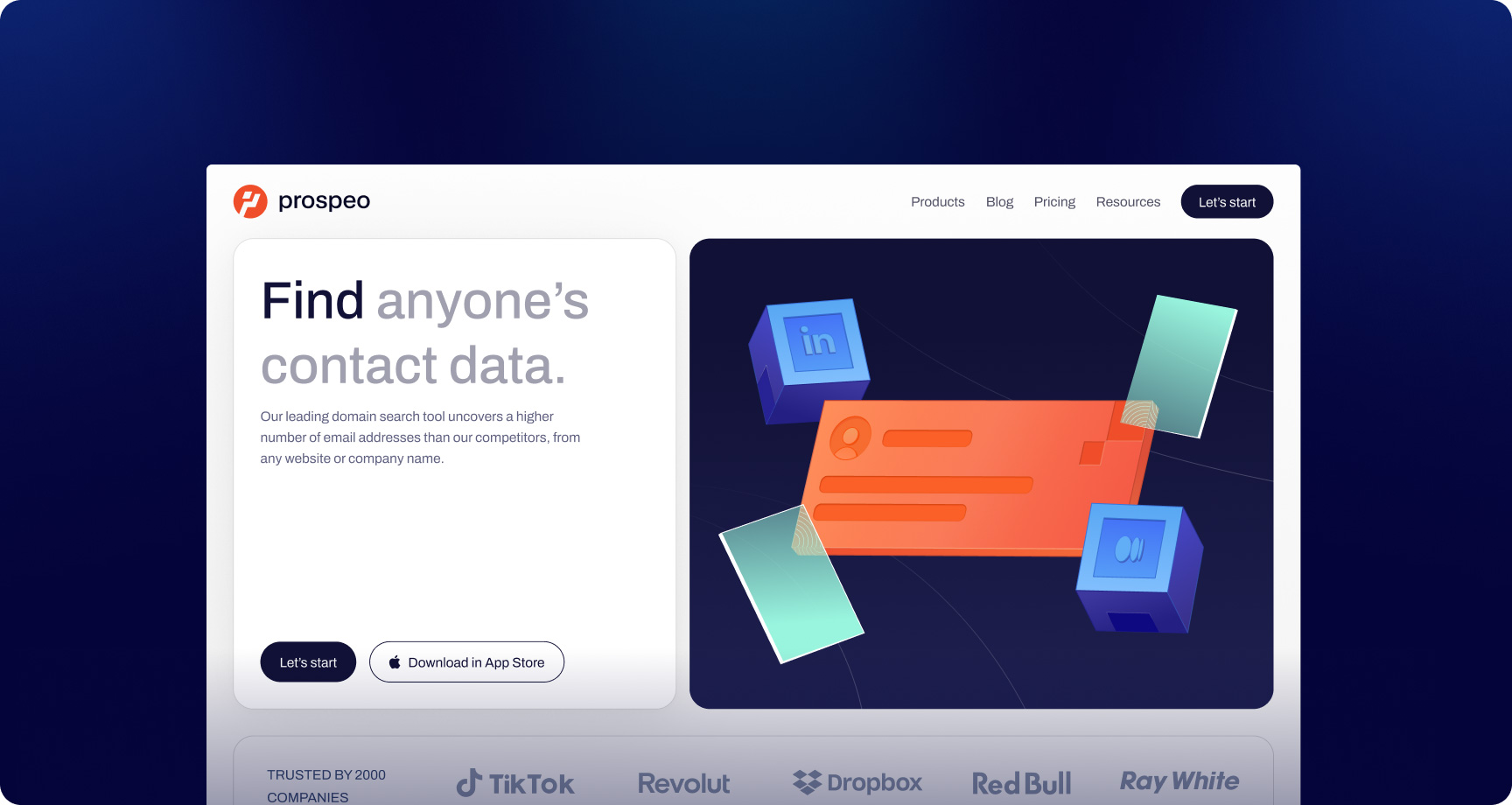
Clarity in Value Proposition
Your value proposition should be so clear that even someone who hasn’t had their morning coffee can understand it. If visitors land on your site and have to play detective to figure out what you do, you’ve already lost them.
Best practices
- Concise and clear messaging – Avoid jargon and explain your product in simple terms.
- Prominent positioning – Your value proposition should be above the fold (visible without scrolling).
- Specific benefits over features – Instead of "AI-powered analytics," say “Save 10 hours a week with AI-powered insights.”
Example:
Bad: "A next-gen AI-powered SaaS platform for digital transformation."
Better: "Save 10 hours a week with automated workflows that actually work."
User-Friendly Design & Intuitive Navigation
A poorly designed SaaS website is like a badly organized grocery store—frustrating, confusing, and likely to make people leave without buying anything. If users can’t find what they need in seconds, they won’t stick around to admire your modern typography choices.
Key Elements:
- Minimalist, clean design – Avoid unnecessary elements that distract users.
- Logical structure – Users should always know where they are and how to proceed.
- Mobile optimization – More than 50% of web traffic comes from mobile devices, so your site must be responsive.
Fast load times – Page speed impacts conversions. Google recommends under 2.5 seconds.
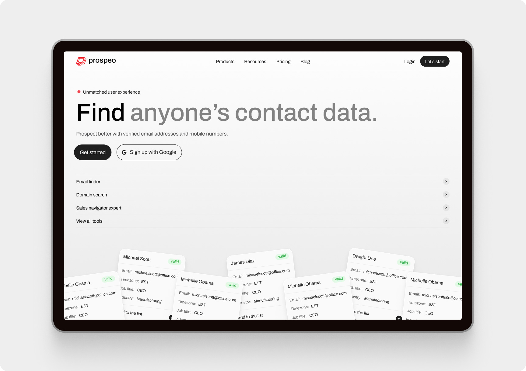
High-Impact Call-to-Actions (CTAs)
Your CTA is the moment of truth. Will your visitors take the plunge, or will they vanish into the internet abyss? A weak CTA is like a salesperson who ends a pitch with "…or not, whatever."
CTA Optimization Tips:
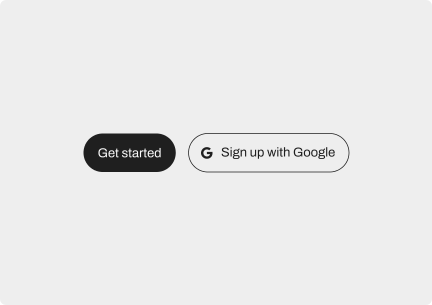
- Be action-oriented – "Start Free Trial" is better than "Learn More."
- Use contrasting colors – Your CTA should stand out visually.
- Place CTAs strategically – Above the fold, within product descriptions, and at the end of pages.
- Reduce friction – Instead of long sign-up forms, allow users to sign up with Google or email with one click.
Example:
Bad: "Click here for more details."
Better: “Try for Free – No Credit Card Required.”
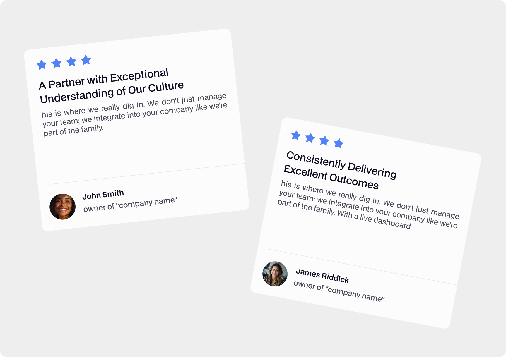
Trust Signals & Social Proof
SaaS buyers have been burned before. They’re skeptical, they’re wary, and they’ve seen one too many "limited-time offers" that somehow last forever. Your job is to convince them you’re the real deal.
Ways to Build Trust:
- Customer testimonials – Real quotes from satisfied users.
- Case studies – Show how companies achieved success with your software.
- Logos of clients – Display well-known brands you work with.
- Trust badges – Secure payment, GDPR compliance, or awards.
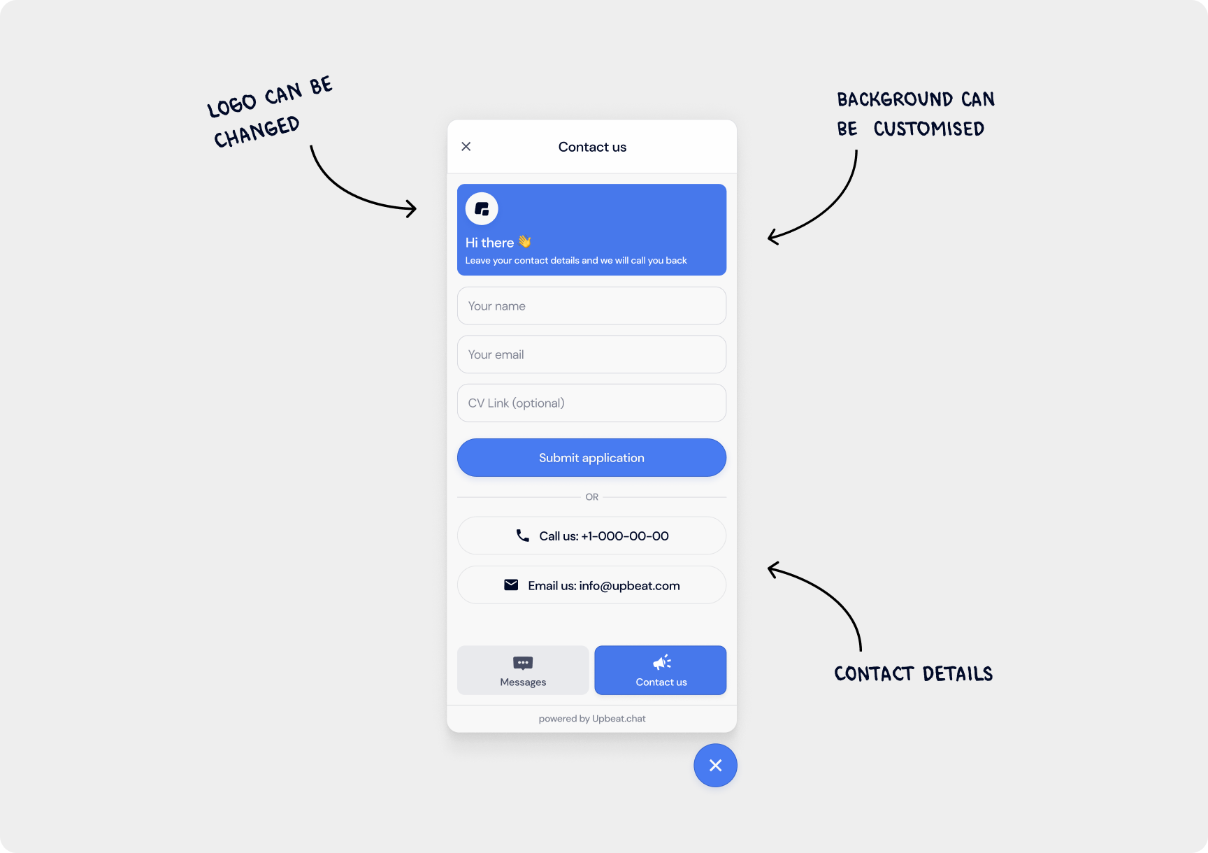
Engaging Product Demonstrations
Your SaaS product might be brilliant, but unless visitors can see it in action, it’s just words on a page. People don’t buy what they don’t understand.
Effective Demonstration Strategies:
- Explainer videos – Short (1-2 min) walkthroughs of key features.
- Live demos – Allow users to test the product instantly.
- Screenshots & GIFs – Visual aids that highlight functionality.
- Interactive tours – Onboarding wizards to guide users through their first steps.
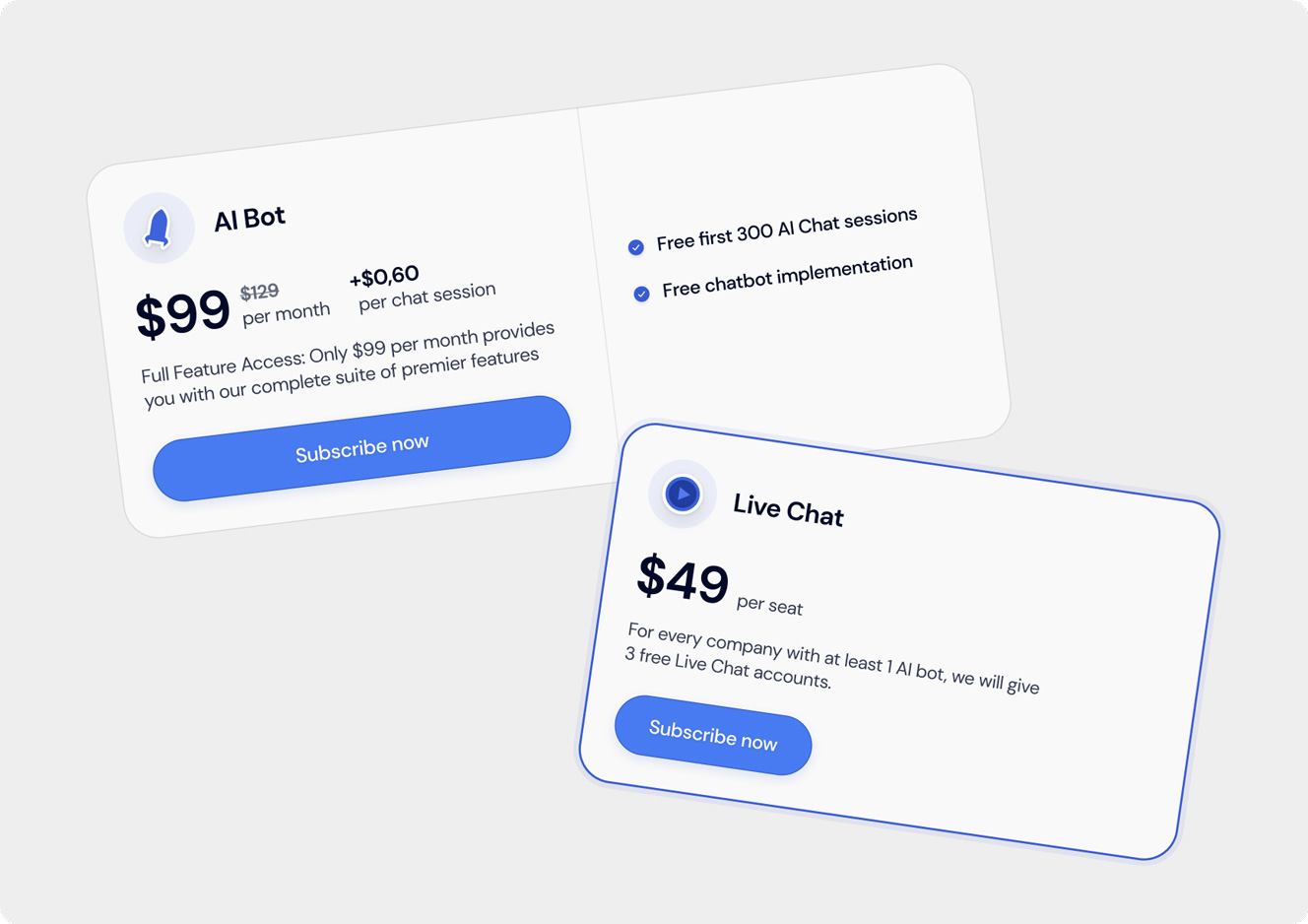
Clear and Simple Pricing
Nothing scares away potential customers faster than "Contact Us for Pricing." If you have to hide your pricing, people assume it’s expensive—or worse, complicated.
Pricing Page Best Practices:
- Use simple, digestible plans – Show key features of each plan in a comparison table.
- Emphasize the best option – Highlight the most popular plan.
- Offer free trials or demos – Reduce hesitation by allowing users to test before committing.
- Avoid hidden costs – Users should know exactly what they’re paying for
SEO Optimization for Organic Traffic
A high-converting SaaS website isn’t just about design—it must be discoverable.
SEO Essentials:
- Targeted keywords – Use terms SaaS buyers search for (e.g., "best CRM for startups").
- Optimized meta titles & descriptions – These influence click-through rates.
- Blog content strategy – Regularly publish high-quality content that attracts organic traffic.
Fast-loading pages – Google ranks faster websites higher in search results.
Personalized User Experience
A one-size-fits-all approach won’t maximize conversions. Personalized experiences lead to higher engagement.
How to Personalize:
- Dynamic CTAs – Show different messages based on user behavior.
- Geo-targeting – Display relevant content based on the visitor’s location.
- Behavior-based pop-ups – Offer discounts or free trials to users who show exit intent.
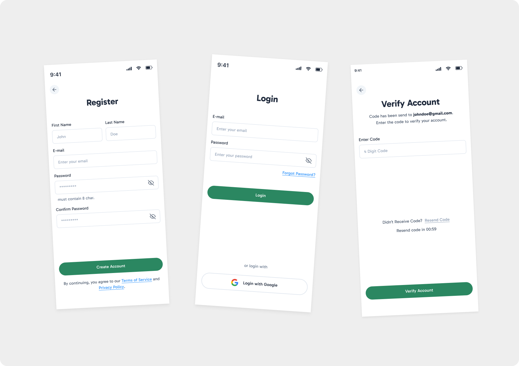
Smooth Onboarding Process
A great website experience doesn’t stop after sign-up. Your onboarding process must quickly get users to their "aha moment"—the realization that your product solves their problem.
Onboarding Best Practices:
- Guided setup wizards – Walk users through essential first steps.
- Progress indicators – Show users how far they are in the setup.
- In-app tutorials – Provide tooltips and interactive guides.
- Personalized onboarding emails – Send follow-ups with helpful tips.
Conclusion: Turning Visitors into Paying Customers
A high-converting SaaS website isn't just about aesthetics; it’s about usability, clarity, and trust. By optimizing your value proposition, design, CTAs, and user journey, you can significantly increase sign-ups, demo requests, and revenue.
If you’re looking to revamp your SaaS website for better conversions, our team at Integritas can help. We specialize in designing and developing high-performing SaaS platforms tailored to your audience’s needs.