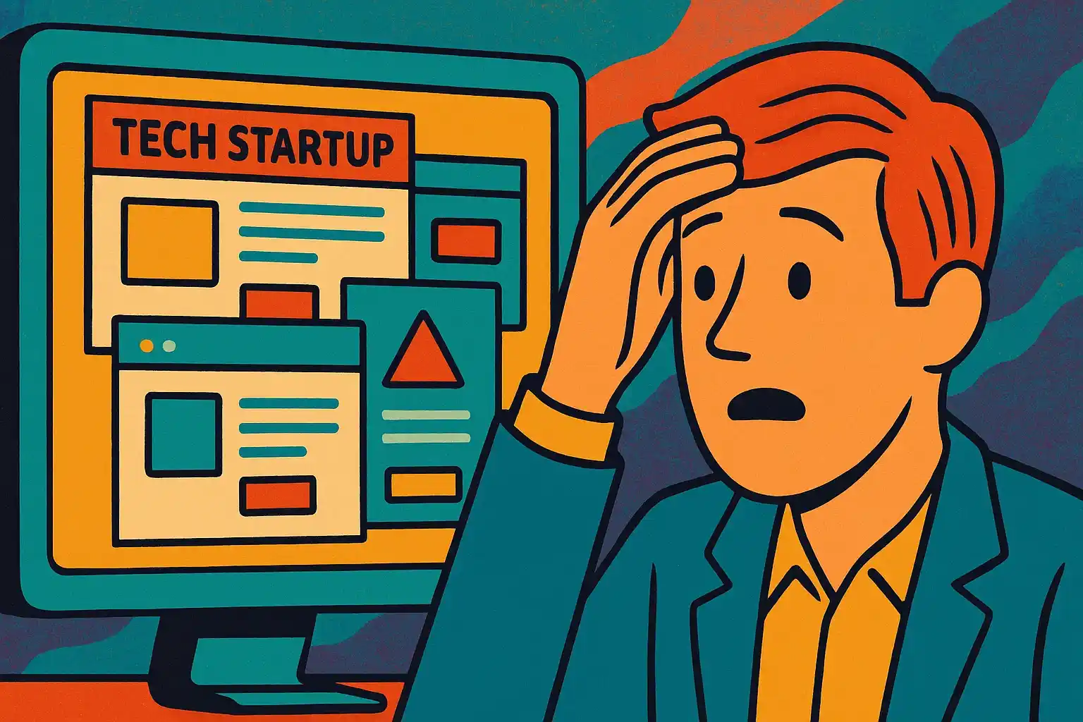
Let’s face it: if you’re serious about running a tech company, your Startup website can’t look like it was thrown together on a Saturday night after two Red Bulls and a dream.
It has to work . It has to impress . It has to convert .
And it definitely has to make your competitors whisper, “Damn, we need a rebrand.”
As a UX/UI designer and co-founder of an IT outsourcing company, I’ve seen enough Startup websites to know that the best ones don’t just look good — they make you believe in the product before you even know what it does.
Today, I’ll show you what the top Startup websites get right, and how you can steal (ethically, of course) their best moves.
👉 Oh, and if you want a Startup website like these without selling your kidneys, check out our web development services for SaaS .
What Makes a Startup Website Truly Great? Before we get starry-eyed over beautiful designs, let’s talk basics.
A great Startup website:
Communicates value instantly Feels effortless to navigate Looks like it belongs in 2025, not 2015 Builds trust without 18 popups Actually helps users take the next step
Pro tip: In UX (User Experience), we say “don’t make users think.” Your Startup website should be intuitive, not a puzzle.
10 Best Tech Startup Websites to Inspire Your Glow-Up Prepare to open 10 tabs and question your life choices.
1. Stripe Ah, Stripe — the Beyoncé of Startup websites.
Why it works:
Clean typography, flawless animations, and a feeling that they could literally take over the global economy by lunchtime.
Lesson for your Startup website:
Clear CTAs, luxurious white space, and confident product shots = instant credibility.stripe.com
2. Notion Notion’s Startup website whispers minimalism while sneakily flexing complex features.
Why it works:
Subtle onboarding right on the homepage. It sells you on possibilities, not products.
Lesson:
Show users what life could look like with your product, not just what the product is .
👉 notion.so
3. Webflow If Webflow’s Startup website doesn’t make you want to start wireframing immediately, are you even alive?
Why it works:
Bold visuals, interactive elements, and a homepage that evolves with trends faster than your wardrobe.
Lesson:
Invest in micro-interactions — those tiny animations that make a site feel alive.webflow.com
4. Figma Figma’s site feels like it was designed by...well, Figma users.
Why it works:
A massive focus on collaboration, supported by smart UI and strong social proof.
Lesson:
Highlight your product’s community aspect if it exists — it builds loyalty faster.
👉figma.com
✨ Need help before it’s too late? Check our Web Development for SaaS services here and save yourself.
Let's talk 5. Linear Linear’s Startup website is so clean it makes Marie Kondo cry.
Why it works:
It’s brutally minimalist — but every word, every pixel earns its place.
Lesson:
Resist the urge to over-explain. Let your product’s clarity do the talking.
👉linear.app
6. Superhuman Superhuman's branding is like caffeine for your eyeballs.
Why it works:
They position email as a luxury experience, not a daily chore.
Lesson:
If your Startup website can reframe a mundane product as aspirational, you win.
👉superhuman.com
7. Loom Loom knows that less talking about video = more showing video.
Why it works:
Embedded videos, minimal copy, and social proof front and center.
Lesson:
If a picture’s worth a thousand words, a product demo’s worth a million.
👉loom.com
8. Pitch Pitch’s Startup website is slicker than your last Tinder date’s bio.
Why it works:
Vibrant colors, smart animations, and a homepage that feels like you’re already using the app.
Lesson:
Make your website feel like your product. Familiarity builds comfort.
👉pitch
9. Vercel Vercel’s dark theme, futuristic vibe, and snappy animations are pure tech startup energy.
Why it works:
Developer-focused, but still beautiful. They speak the language of their audience.
Lesson:
Know your target user. Don’t dumb it down if they’re tech-savvy.
👉vercel
10. Revolut Technically fintech, but the Startup website is still worth drooling over.
Why it works:
Global appeal, sleek design, and instant clarity on benefits.
Lesson:
Even if your service is complex (looking at you, banking), your website should feel simple .
👉revolut
Common Threads Among the Best Startup Websites Spot the pattern?
The best Startup websites:
✅ Use minimal, powerful copy
✅ Prioritize speed and mobile responsiveness
✅ Feature real product shots
✅ Show user benefits, not features
✅ Respect visitors’ time (no endless scroll to nowhere)
In other words, they don’t just look good — they work smart.
How to Upgrade Your Own Startup Website Without a Meltdown Feeling inspired (or mildly panicked)? Good. Here’s your action plan:
Audit your current site: Brutally. Would you trust your own startup based on your website alone? Simplify your messaging: Kill the buzzwords. Kill them all. Invest in custom visuals: Even a few professional screenshots can lift your whole vibe. Fix your UX: No one should click more than twice to find what they need. Work with pros: (Hint hint 👉 That’s us ). Remember: A bad Startup website doesn’t just hurt your brand. It actively repels users — and investors.
Final Words: Rebrand or Die Trying Building a great Startup website isn’t just about looking pretty.
It’s about building trust, removing friction, and making people believe in your product before they’ve even clicked “Sign Up.”
The good news?
You don’t need a $500k agency budget to build something incredible.
You just need the right design, the right partner — and the guts to hit "Publish."
Still unsure where to start?