Egor Mihachkin
Designer
ERP systems are complex because they handle everything—inventory, sales, HR, finance, procurement. The problem? Most ERP interfaces throw all that complexity at users with zero regard for usability. The solution isn’t just about making things "pretty"—it’s about making them usable.
Before designing an ERP system, you need a logical structure. This means:
Think of it like organizing a kitchen: the salt and pepper should be near the stove, not buried in a random drawer. Your ERP system should work the same way—everything in its right place.
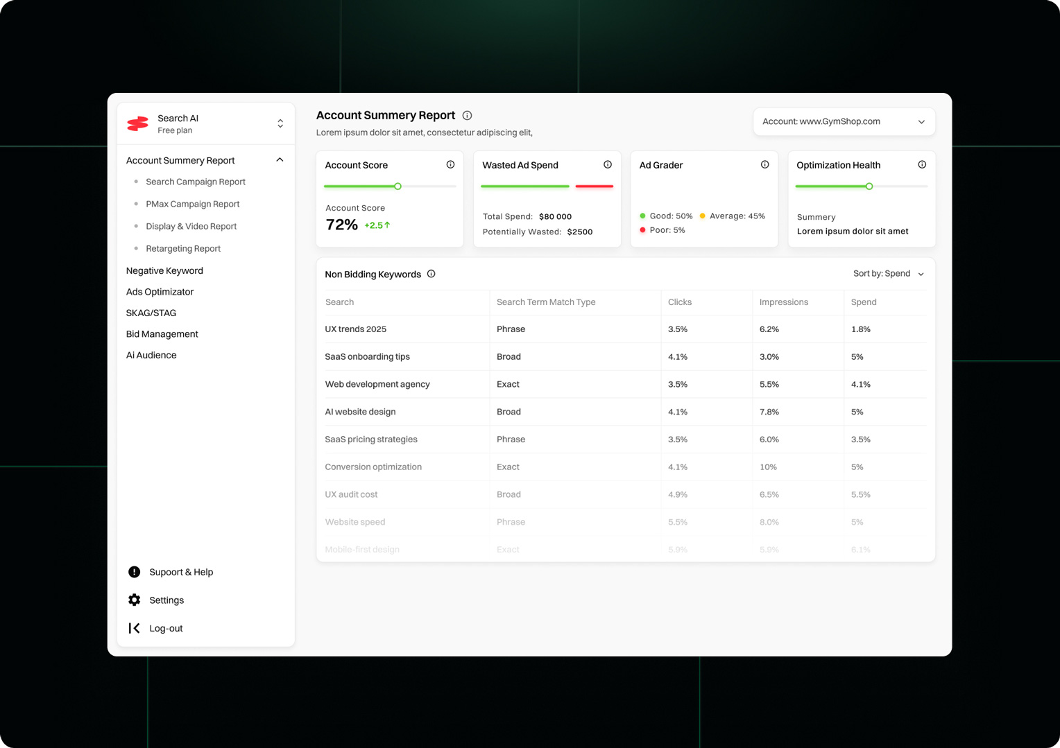
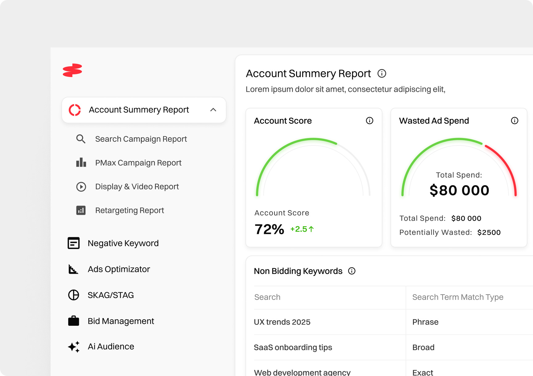
ERP dashboards love information overload. But do users really need to see sales, inventory levels, HR reports, and system logs all at the same time? No.
The fix? Progressive disclosure—show only what’s necessary, then reveal more details when needed. Think of it as a "need-to-know basis" approach to UI.
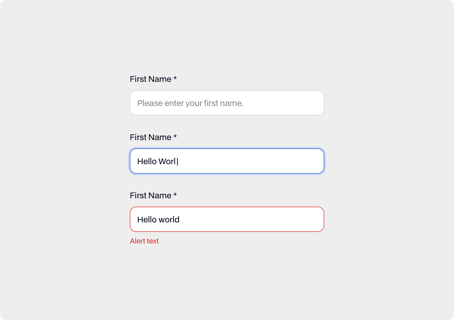
ERP systems are infamous for tedious data entry. If your interface looks like an Excel spreadsheet on steroids, users will hate it. Instead:
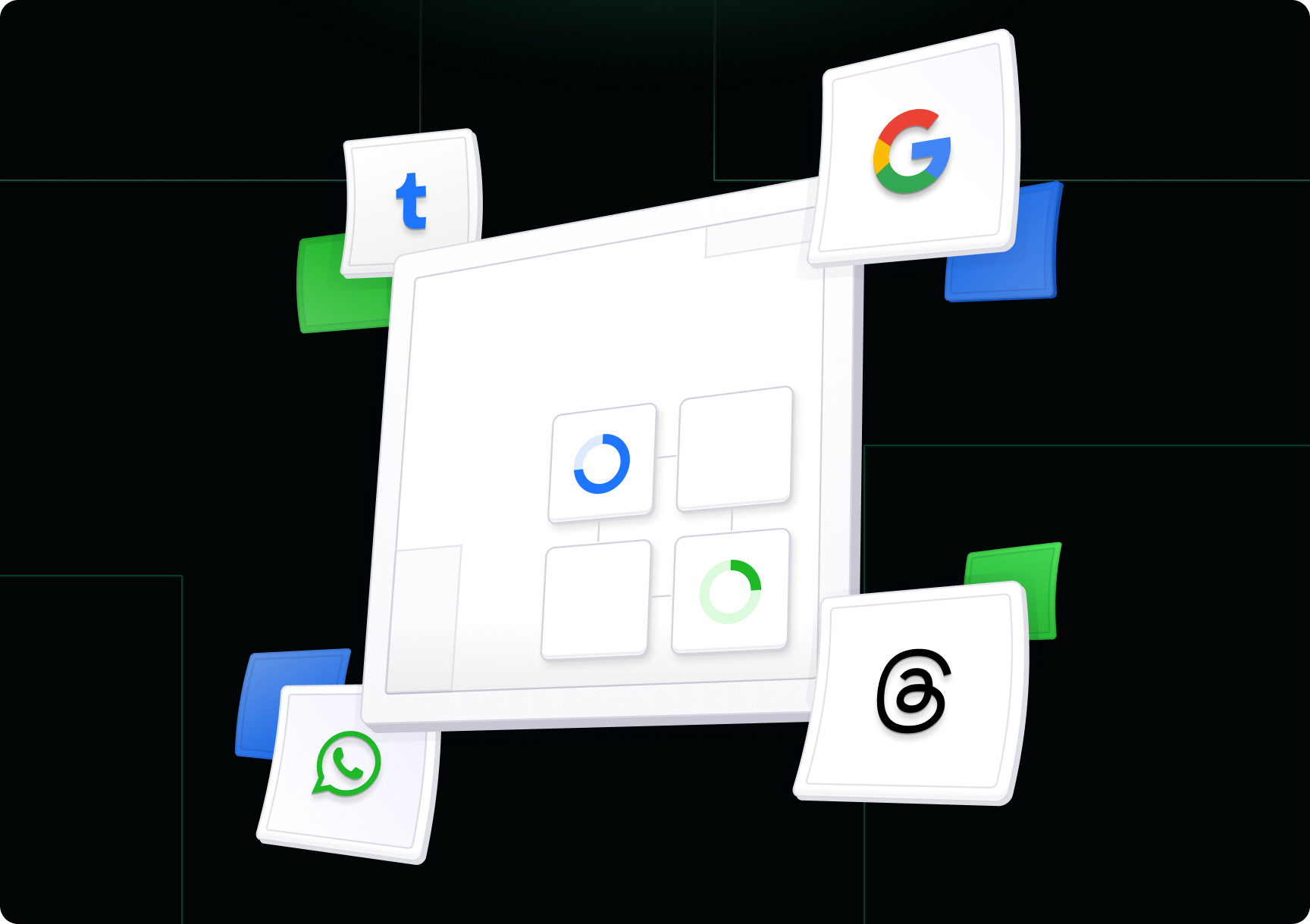
Ever used an ERP system where every module has a different layout? It’s frustrating. Standardizing UI components (buttons, menus, tables, etc.) creates familiarity, reducing cognitive load. Users shouldn’t have to relearn how to use each module.
Users should instantly know where to look when they open an ERP interface. Design principles like:
…help direct attention and improve usability.
A beautifully designed ERP system is useless if it takes forever to load. Performance optimization techniques like:
…ensure that users spend less time waiting and more time working.
Simplifying ERP design doesn’t mean dumbing it down. It means removing unnecessary friction, streamlining processes, and making complex tasks manageable. The best ERP UI/UX isn’t just "modern-looking"—it’s intuitive, efficient, and (dare we say?) even enjoyable.
If your ERP system is making users suffer, it’s time for a design overhaul. Because let’s face it—nobody should need a PhD just to use their business software.