The Startup Website Survival Guide: Look Funded on a Founder's Budget
Your startup website is doing a job whether you planned it or not: deciding, in seconds, whether a visitor takes you seriously. Most founders get it backwards, treating the site as an autobiography instead of a sales tool. This survival guide covers what a startup website actually needs to convert, how to look funded without a big budget, and the mistakes that quietly send visitors away.
First Rule of Startup Websites: Nobody Cares About You (Yet)
Most founders think their website should tell their company's life story. Wrong. Your website needs to answer one question immediately: what problem do you solve for me? Until you are a household name like Slack or Zoom, visitors are not buying your vision, they are buying a solution to their specific problem.
This is the mental shift that fixes most startup websites. The visitor arrived with a need, not curiosity about your founding journey. Lead with their problem and your solution, and you earn the attention to share more later. Lead with your story, and they are gone before they reach it. Self-focus feels natural and converts terribly.
How to Make It About Them, Not You
Making the site about the visitor is mostly about your headline and structure. Open with a clear headline that states what you do and who it helps, in plain language. Follow with the problem you solve and how, then proof that you can be trusted, then an obvious next step. Every section should answer a question the visitor actually has, not one you wish they were asking.
The test is simple: read your homepage as a stranger with thirty seconds and a specific problem. If it speaks to them, it works. If it reads like an "about us" page wearing a homepage costume, rewrite it around the visitor.
Essential Startup Website Ingredients (That Make You Look Funded)
1. A Hero Section That's Actually a Hero
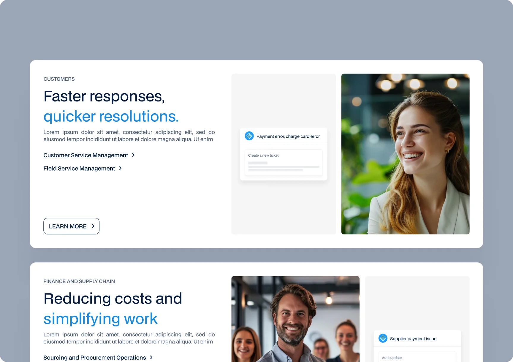
The hero section, the first thing visitors see, has to do the heavy lifting: a clear value proposition, a strong visual, and an obvious call to action, all above the fold. This is where most visitors decide whether to stay, so a vague or cluttered hero costs you the majority of your audience before they scroll. Make it clear, confident, and focused on the visitor's problem.
2. Real Screenshots, Not Figma Mockups
Show your actual product, not idealized mockups of features that do not exist yet. Real screenshots build trust because they prove the product is real and let visitors picture using it. Polished fantasy mockups, by contrast, read as vaporware to anyone paying attention. Authenticity converts better than aspiration.
3. Testimonials That Aren't Your Cousin
Social proof is powerful, but only if it is credible. Real testimonials from real customers, ideally with names, companies, and specific results, build trust. Vague, anonymous praise that could have come from your relatives does the opposite, quietly signaling you have nobody real to quote. A little genuine proof beats a wall of generic compliments.
How to Stretch Your Budget Without Stretching the Truth
1. Prioritize Core Pages
You do not need twenty pages to launch. Focus your budget on the few that matter: a strong homepage, a clear product or features page, pricing, and a contact or signup path. A handful of excellent pages beats a sprawling site of mediocre ones, and it costs far less to build well. Add more only when you have a real reason to.
2. Use Design Systems, Not Templates
A design system, a consistent set of components and styles, lets you build a coherent, professional-looking site efficiently without resorting to a generic template that screams "off the shelf." It gives you the polish that signals funding and the consistency that builds trust, at a budget a startup can actually manage. It is the smart middle ground between expensive custom design and cheap templates.
The Secret Weapon of Smart Startup Websites: Outsourcing
You are a founder, not a full-time web team, and trying to build the site yourself between everything else usually produces something that looks exactly that rushed. Outsourcing the website to people who do it well frees your time for the work only you can do, while ensuring the site that represents you actually represents you well.
The key is choosing a partner who understands startups and budgets, who can deliver a focused, professional site without the bloat and cost of an enterprise project. Done right, outsourcing is not an expense, it is how a small team gets a website that punches above its weight, the kind our SaaS team specializes in.
Startup Website Survival Kit (Checklist)
Before you launch, confirm the essentials: a clear headline that states what you do and for whom, a strong hero with an obvious CTA, real product screenshots, credible testimonials, a simple pricing or signup path, fast load times, a solid mobile experience, and a consistent, professional look. If those are in place, you have a website that converts and looks funded, regardless of how much you spent.
The Most Common Startup Website Mistakes
Beyond the essentials, a few recurring mistakes quietly sabotage startup websites. The biggest is making it about you instead of the visitor, opening with your story rather than their problem. Close behind is burying or weakening the call to action, so even interested visitors are not sure what to do next. Then there is feature overload, listing everything you built instead of leading with the outcome people care about.
Other frequent slips include neglecting mobile, where much of your traffic actually is, slow load times that lose people before they read a word, and vague buzzword copy that says nothing specific. None of these require a big budget to fix, they require the discipline to design for the visitor rather than for yourself. Avoid them and your site already outperforms most of the competition, which made the same mistakes.
Final Irony: Looking Funded Might Get You Funded
Here is the loop that makes this worth doing properly. A professional, confident website makes you look like a serious, funded company, which builds the trust that attracts customers and investors, which helps you actually get funded. Conversely, a rushed, amateurish site signals struggle, which repels the very people who could change that. Your website is not just a reflection of where you are, it influences where you go next. Build it to look like the company you are becoming, and it helps you become it.