Top SaaS Design Trends: What Everyone Will Be Copying This Year
It’s that time of year again—when every startup proudly reinvents the wheel with a rounded corner and a pastel gradient. As a UX/UI designer and co-founder of an IT outsourcing company, I’ve seen one thing remain consistent: everyone wants to “stand out” by doing exactly what everyone else is doing. Especially in SaaS Design.
So let’s dive in and explore what you’ll be pretending to "invent" this year.
Top SaaS Design Trends Everyone Will Copy This Year (Whether They Should or Not)
Every year a fresh batch of SaaS design trends sweeps the internet, and every year teams copy them without asking whether they actually help. Some of this year's trends are genuinely useful. Others are design theater, things that look impressive in a portfolio and quietly confuse real users. This is a slightly jaded tour through the trends everyone will copy, what is wrong with most of them, and what actually works.
Trend 1: The Rise of Empty Minimalism
White Space, or Just No Content?
Minimalism used to be about clarity. This year it is increasingly about proving you can afford not to explain things. The trend is "less is more," as in less copy, fewer icons, and maximum confusion. Users will not know where to click, but they will certainly admire all that white space while they hunt for the button. Minimalism is wonderful when it removes clutter, and counterproductive when it removes the information people need.
Font Size Inflation
The companion trend is enormous typography, where you essentially shout "Login" at users with an H1-sized button. Big type can create hierarchy and focus, but taken to extremes it just means less content fits on screen and everything feels like a billboard. There is a difference between bold and loud, and a lot of this year's design forgets it.
Trend 2: Illustrations From the Land of Eternal Sameness
Vector People With No Faces
You know the style: flat, abstract vector people, often with oddly proportioned limbs and no faces, in a tasteful pastel palette. They are everywhere, which is exactly the problem. When every SaaS uses the same illustration style, none of them stand out, and the visuals that were meant to convey personality instead convey that you used the same asset library as everyone else.
The Illusion of Personality
These illustrations promise brand personality and deliver brand sameness. They feel like a safe choice because they look professional and current, but safe and forgettable are close cousins. Real visual personality comes from choices specific to your brand, not from the trend pack that ten thousand other companies also downloaded.
Trend 3: Overcomplicated Simplicity
The UX Paradox
Here is a delicious contradiction: interfaces so obsessed with looking simple that they become hard to use. Functions hide behind cryptic icons, common actions require extra clicks, and the pursuit of a clean look quietly buries the things users actually need. Simplicity in appearance and simplicity in use are not the same thing, and this trend constantly confuses them.
Microinteractions for Macrosuffering
Then there are the animations. A tasteful microinteraction can delight, but the trend pushes them everywhere, so every click triggers a little performance. It demos beautifully and then slows down the power user who does the same action fifty times a day. Motion should guide attention, not audition for applause, and a lot of this year's microinteractions forget whose time they are spending.
Trend 4: AI Integration You'll Never Need
"Powered by AI," Whatever That Means
This year, slapping "powered by AI" on the interface is practically mandatory, whether or not the AI does anything useful. Sometimes it is genuine and helpful. Often it is a feature added so the homepage can say "AI," delivering a vague capability nobody asked for. Users have grown wise to this, and AI for the sake of the label increasingly reads as noise rather than innovation.
Chatbots That Outsmart You (at Being Useless)
The mandatory AI chatbot deserves special mention. It pops up before you have read a sentence, asks how it can help, and then cannot answer the one question you have. A genuinely helpful AI assistant is great. A chatbot bolted on to look modern, blocking the content while failing to assist, is the trend at its most self-defeating.
So, Should You Copy These Trends Too?
The honest answer is: only where they genuinely serve your users. Trends are not inherently bad, they become bad when adopted thoughtlessly because everyone else did. Minimalism that clarifies is great; minimalism that hides is not. Microinteractions that guide are lovely; ones that slow people down are not. AI that helps is valuable; AI for the label is noise. The discipline is asking what each trend does for your actual users, not how current it makes you look.
What Actually Works?
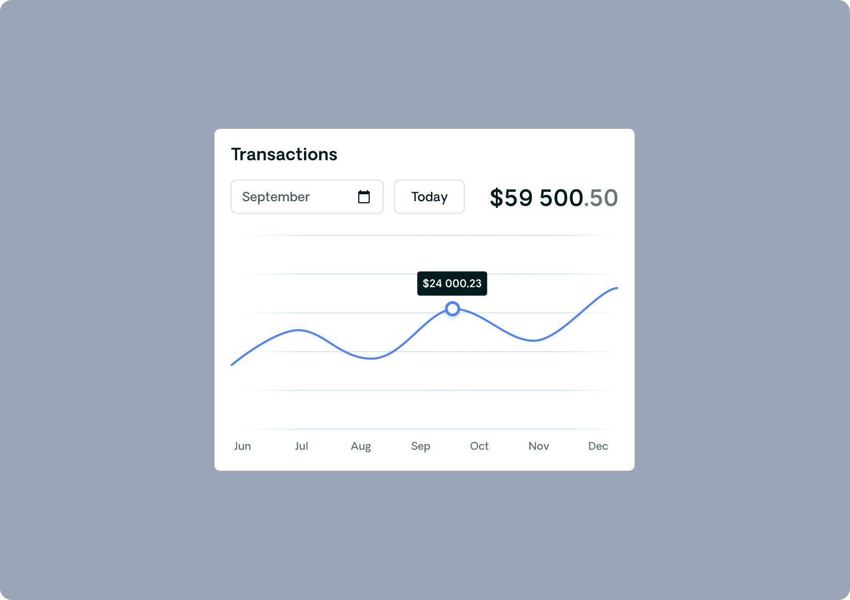
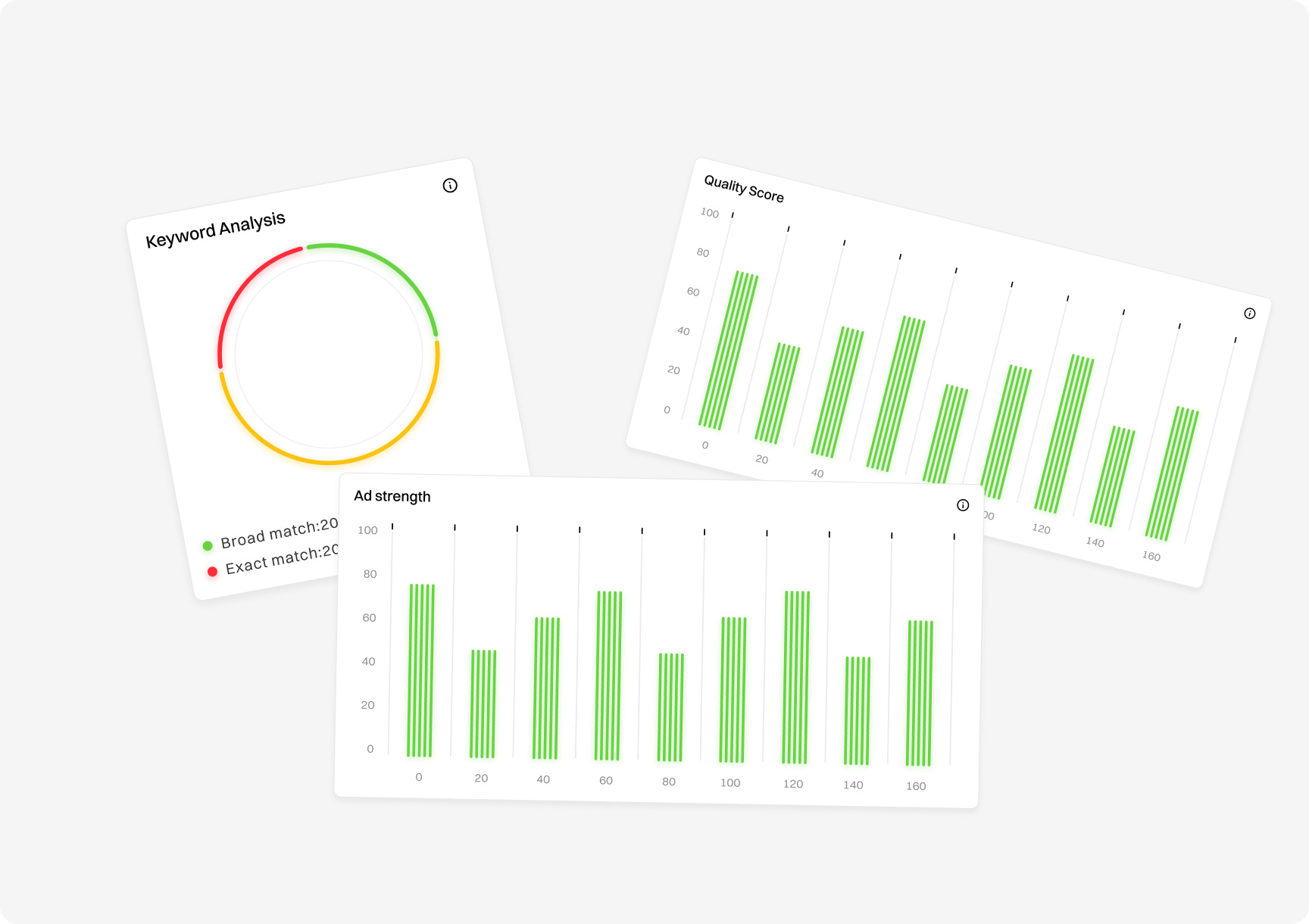
Underneath the fashion, the timeless fundamentals still win. Clarity about what your product does and how to use it. Fast load times. Obvious calls to action. Genuine visual identity rather than borrowed trend packs. A design that respects the user's time and intelligence. These are not exciting enough to be "trends," which is precisely why they keep working year after year while the fashionable choices age badly. You can see this fundamentals-first approach in our work, like the Search AI analytics platform case study.
How to Tell a Good Trend From a Bad One
If trends are a mix of genuine improvements and empty fashion, how do you tell them apart before committing? Ask what problem the trend solves for your users. A good trend addresses a real need: clearer information, faster comprehension, less friction. A bad trend solves a problem you do not have, or worse, creates one, by prioritizing how the design looks to other designers over how it works for actual customers.
The second test is durability. Genuinely good design ideas tend to stick around and become fundamentals, while empty fashion burns bright for a year and then dates the products that adopted it. When you find yourself drawn to a trend, pause and ask whether you would still want it in three years if it were no longer fashionable. If the answer is yes because it genuinely helps users, adopt it. If the answer is no, you were chasing fashion, not function.
SaaS design trends are fun to watch and dangerous to follow blindly. The ones everyone will copy this year, empty minimalism, samey illustrations, overcomplicated simplicity, and decorative AI, all look impressive and frequently hurt the actual experience. The cure is not ignoring trends entirely, it is judging each one against a single question: does this help my users, or does it just help me look current? Adopt the trends that pass that test, skip the ones that do not, and lean on the unfashionable fundamentals that quietly outperform every trend in the long run.
Egor Mihachkin
Designer
Egor has over 6 years of experience as a UX UI Designer & Graphic designer, he loves to create products that deliver value
The most copied ones are aggressive minimalism with lots of white space, abstract flat illustrations, "simple" interfaces that hide functionality, and prominent AI features and chatbots. Some genuinely help, but many are adopted for appearance rather than usefulness, so judge each against whether it actually serves your users.
Should I follow SaaS design trends?
Only where they genuinely improve the user experience. Trends are not bad in themselves, but copying them thoughtlessly often hurts usability. Minimalism that clarifies, motion that guides, and AI that genuinely helps are worth adopting; the same trends applied for looks alone tend to confuse users and age badly.
What design choices actually work long-term?
The unfashionable fundamentals: clarity about what your product does, fast load times, obvious calls to action, genuine visual identity, and respect for the user's time. These are not flashy enough to trend, which is exactly why they keep working while fashionable choices come and go.
Are SaaS design trends worth following at all?
Selectively. Some trends are genuine improvements worth adopting, while others are empty fashion that hurts usability. The test is whether a trend solves a real problem for your users or just makes you look current. Follow the ones that help, skip the ones that only impress other designers.
Why do so many SaaS products look the same?
Because they all copy the same trends and asset packs, from flat faceless illustrations to identical minimalist layouts. Safe, current-looking choices feel low-risk but produce sameness. Genuine differentiation comes from choices specific to your brand and users, not from the trend pack everyone else downloaded.
What design fundamentals never go out of style?
Clarity about what your product does, fast load times, obvious calls to action, genuine visual identity, and respect for the user's time and intelligence. These are not flashy enough to trend, which is exactly why they keep working while fashionable choices age and date the products that adopted them.
This site uses cookies to help guide you and provide a better user
experience. By using our site, you agree that we use cookies on your device.


_3i6ydo7jm9kqzsic.webp)