Stop Frustrating Your Users: The Art of Usability in Website Design
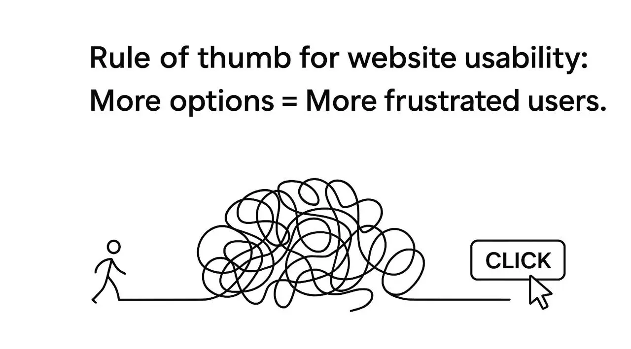
Let’s be honest: if your website is a labyrinth where buttons hide like Easter eggs, no one-except your cat-will ever use it correctly. And that’s where usability in website design comes into play. But what does it actually mean? In plain English, usability is how easy and intuitive your website is for people to navigate, find information, and complete actions. Think of it as the difference between walking down a smooth sidewalk versus climbing a mountain of cobblestones… barefoot.
For SaaS founders and startup owners, understanding usability in website design is less about looking fancy and more about keeping your users alive (metaphorically) and engaged (literally). It’s the backbone of retention, conversions, and overall user happiness-yes, happiness can be quantified, just like your MRR.
Stop Frustrating Your Users: The Art of Usability in Website Design
You can have perfect code, a brilliant product, and copywriters who deserve awards, and still lose visitors the moment they cannot find the button they came for. That is the quiet killer of SaaS growth, and it has a name: poor usability. Usability in website design is not a finishing touch you add at the end, it is the difference between a product people adopt and one that collects digital dust. Here is why it matters and how to actually get it right.
Why Usability in Website Design Matters (Seriously)
Imagine you have just launched a SaaS product. The code is clean, the AI is smart, the marketing is sharp. But your website makes visitors think "I'd rather set my keyboard on fire than find this button." Congratulations, your usability failed, and your perfect product is now invisible. Good usability does three things at once. It delivers clarity, so users instantly understand what your site does with no mental gymnastics. It delivers efficiency, so signing up, buying, or navigating takes fewer clicks, and yes, fewer clicks genuinely matter. And it delivers satisfaction, because happy users are loyal users, and your conversion rate does not just climb, it soars.
Here is an uncomfortable but useful truth: users do not care about your story, your mission, or your AI magic. They care about one thing, can I do what I came here to do without losing my mind? Everything in usability flows from answering that question with a confident yes.
Common Usability Mistakes Even Smart Founders Make
The same mistakes appear again and again, even among experienced teams. Overloading the homepage, because less is more and users do not need your entire roadmap on arrival. Mysterious navigation labels, since "Discover Synergies" might sound clever but tells no one what they will find. Ignoring mobile users, because if your site looks like an abstract painting on a phone, half your audience leaves. And tiny click targets, the buttons so small they need a magnifying glass. Each of these quietly tanks growth faster than a failed launch tweet, and each is entirely avoidable once you know to look for it.
How to Actually Improve Usability (Without Losing Your Mind)
1. Navigation Shouldn't Require a GPS
Here is a tip that may shock you: users do not enjoy treasure hunts. Clear, predictable navigation is the cornerstone of a usable site. That means a logical structure where menus follow natural user expectations, a visible hierarchy where key actions like "Sign Up" or "Start Trial" clearly stand out, and consistent placement so the login button does not move every week because it "looked better somewhere else." If a visitor spends more than three seconds figuring out where to click, you are losing both the click and their patience.
2. Speed Isn't Just Nice, It's Survival
Slow websites are the enemy of a good experience. Every second counts, and in SaaS, milliseconds add up. Optimizing speed means compressing images without destroying their quality, cutting unnecessary scripts that make your site lag, and using modern frameworks that load fast rather than just looking flashy. A one-second delay in load time can reduce conversions by up to 7%, which is money walking straight out the door while your beautiful site is still rendering.
3. Mobile Usability Is Non-Negotiable
If your site is not mobile-friendly, you are effectively telling half your audience good luck using this on a phone on the bus. Buttons must be tappable rather than microscopic. Text should be legible without zooming. Forms should be short, or users abandon them instantly. A usable site works on every device your users actually hold in their hands, not just the large monitor it was designed on.
4. Make Actions Obvious (And Pleasant)
Users should never have to guess how to do something important. Calls to action, forms, and interactive elements must be clear and inviting. Use descriptive labels, so "Get My Free Trial" beats "Click Here." Provide feedback, letting users know when something happens, even if it is "Oops, try again." And guide people gently with microcopy, your quiet secret weapon, explaining things without lecturing. If users struggle to operate your product, even the best backend will not save you.
5. Test, Test, Test (Yes, With Real Humans)
No amount of theoretical UX knowledge replaces watching real people use your site. Their confusion is your free consultancy. Run usability tests with at least five to ten people per major iteration, observe where they hesitate, backtrack, or rage-quit, and fix those issues immediately, because that one tiny misclick matters more than you think. Skipping testing is like building a spaceship and hoping it reaches Mars without a flight plan.
Your users won’t read your mind—but they will leave your website
Let us cut the fluff: if your website is confusing, users bounce, and bouncing users mean lost conversions and a sad founder. Better usability means smoother sign-ups, fewer abandoned flows, and more trial activations. Think of usability as a silent salesperson, it never sleeps, never complains, and never misreads a user's intent. Your product might be brilliant, but if people cannot figure it out in five seconds, the brilliance never gets a chance to land.
Retention Follows Usability
Happy users stay, confused users leave and tell ten friends to avoid you. A usable site improves retention because people feel competent, confident, and even a little delighted. Retention is not just a metric, it is a growth lever: the easier you make it to navigate, understand, and use your product, the more likely users are to stick around, upgrade, and recommend you to others.
Usability Equals Credibility
Ever landed on a site that looked like it was built in 1999 and immediately doubted the company behind it? Usability shapes perception. Clean layouts build trust, intuitive navigation signals professionalism, and clear calls to action communicate competence. Investing here is not only better UX, it tells visitors your startup is reliable, polished, and ready for serious business.
Start Thinking About Usability Now
The irony is that usability often gets treated as a nice-to-have for later. It should be a must-have from day one. Startups that prioritize it see better onboarding, higher retention, and more conversions, without spending more on ads or marketing gimmicks. So if you are serious about growth, stop ignoring it. Watch your users, streamline their journey, and make every interaction effortless, because in SaaS this is not optional, it is survival. Ready to turn your website into a conversion machine? Learn how our team can boost your SaaS with expert usability work.
Usability and Visual Design Are Not the Same Thing
It is worth clearing up a common confusion: a beautiful site and a usable one are not automatically the same. Visual design is how it looks, usability is how it works, and plenty of stunning sites are quietly miserable to use. A gorgeous hero section means nothing if the visitor cannot find the pricing page, and a slick animation is worse than useless if it delays the moment someone can click "Start Trial." The two should support each other, with the visuals guiding attention toward the actions that matter rather than competing with them.
The practical test is simple: hand your site to someone who has never seen it and ask them to complete a real task, sign up, find a feature, contact support. If they hesitate, backtrack, or give up, no amount of visual polish will fix that, because the problem is structural. The most effective SaaS sites treat beauty as a tool in service of usability, not a substitute for it. Looking good gets people in the door; working well is what keeps them there and turns them into customers.
Sofia Shchur
Project manager
Sofia has been a project manager for 10 years, which in startup years is roughly a century. She’s mastered the art of smiling politely while secretly updating the Gantt chart for the 47th time.
It is how easily and pleasantly people can do what they came to do on your site. Good usability delivers clarity, efficiency, and satisfaction: users instantly understand the site, complete actions in fewer clicks, and leave happy. It is not decoration, it is the practical difference between a site that converts and one that frustrates visitors into leaving.
How does usability affect conversion rates?
Directly and significantly. Confusing sites make users bounce, which means lost sign-ups and sales, while clear navigation, fast load times, and obvious calls to action smooth the path to conversion. Even a one-second delay in load time can cut conversions by up to 7%. Usability acts like a silent salesperson working around the clock.
What are the most common usability mistakes?
Overloading the homepage, using vague navigation labels, neglecting mobile users, and making click targets too small. Add slow load times and unclear calls to action and you have the usual suspects. Each is easy to fix once identified, and testing with real users is the fastest way to find the ones hurting your site.
This site uses cookies to help guide you and provide a better user
experience. By using our site, you agree that we use cookies on your device.