Top UI Design Trends for SaaS Applications in 2025
— A brutally honest guide for SaaS founders who want their product to look expensive (even if it’s not)
In the world of SaaS, your interface isn’t just a bunch of pretty buttons. It’s your first impression, your sales pitch, and in many cases — your customer service department. Because let’s face it — nobody’s reading your FAQs if the dashboard already looks confusing.
As an experienced UX/UI designer and co-founder of an IT outsourcing company, I’ve seen enough SaaS platforms to know: trends change, but good design always sells. Below, I’m sharing the top UI design trends for SaaS in 2025 — with a sprinkle of sarcasm because, honestly, some of these trends are both brilliant and ridiculous.
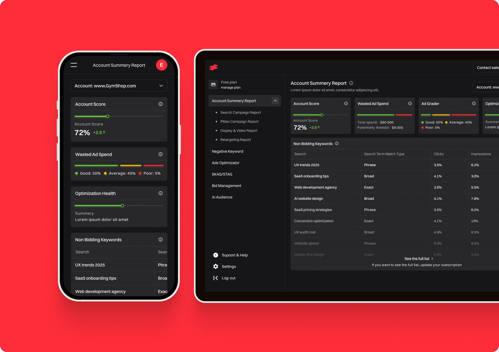
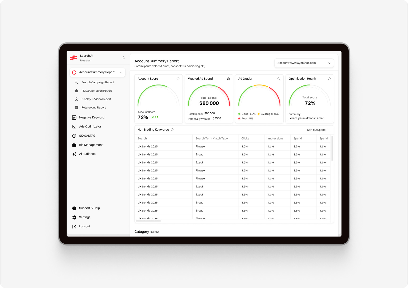
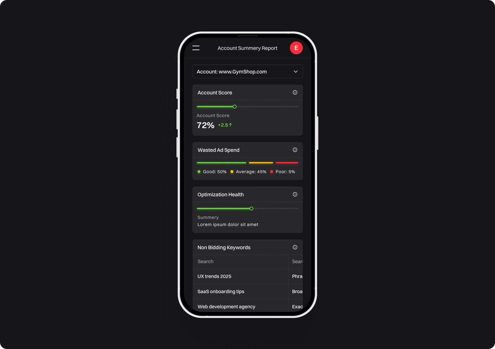
Forget overcrowded dashboards. SaaS UI in 2025 is going full minimal. Why? Because the fewer things a user can click, the fewer mistakes they’ll make — and the fewer support tickets you’ll get.
What Is Minimalism 2.0?
Minimalism 2.0 is not just “lots of white space.” It’s about radical clarity:
Only the most essential features upfront
Aggressive use of space and typography
Micro-interactions replacing clunky popups
If your user is hunting for buttons, congrats — you’re not minimalist, you’re lost.
Dark Mode Is Mandatory (Because Eyes)
2025 and yes — your SaaS dashboard better have dark mode. Not because your users love it. Because their retinas do.
Why Dark Mode?
Reduces eye strain — especially for night owl SaaS founders watching their MRR (Monthly Recurring Revenue) stagnate at 2 AM
Saves battery on mobile devices
Makes your app look instantly cooler (which, let’s be honest, is half the battle)
How to Implement It?
Offer a toggle
Test color contrasts — not every SaaS tool needs to look like a hacker terminal from a bad movie
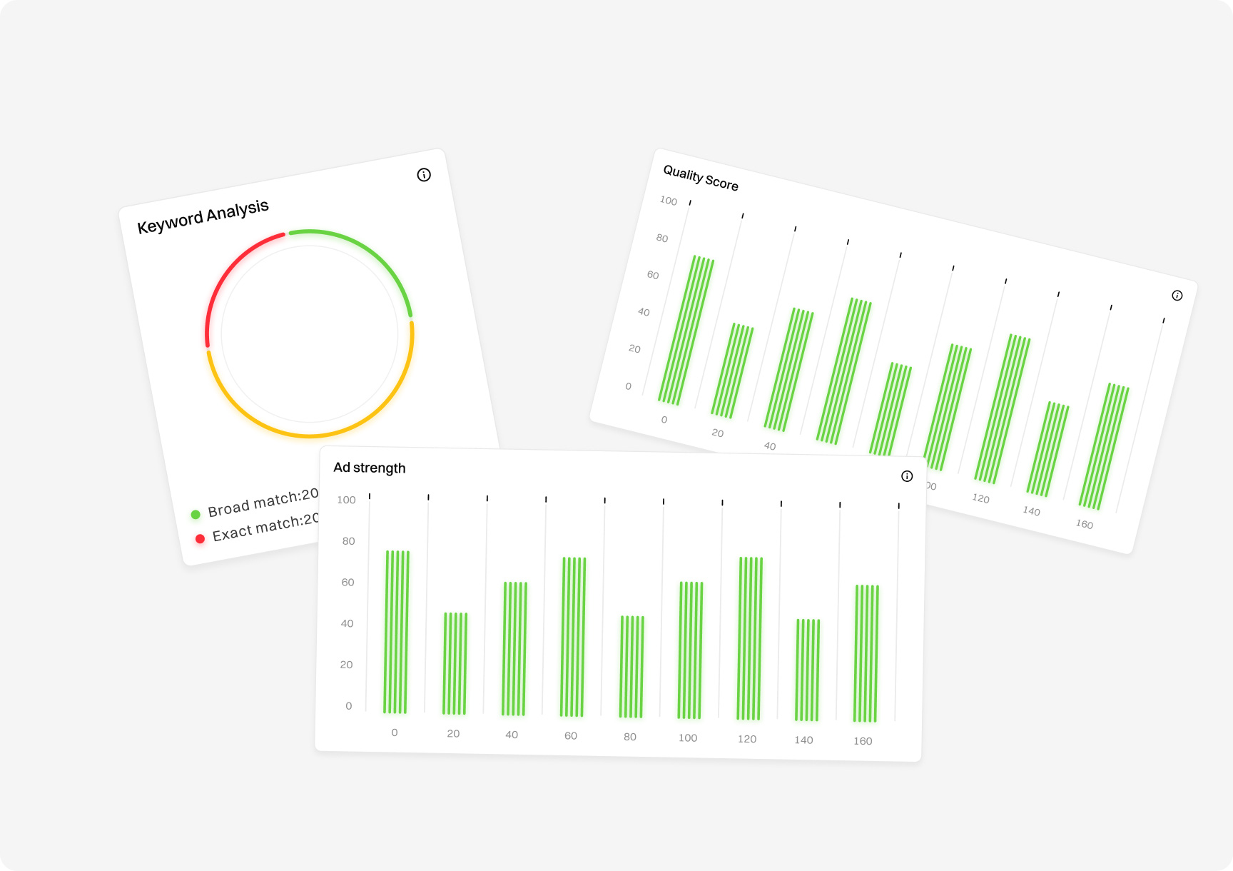
Data Visualization — Pretty Charts Sell
SaaS is mostly about managing data. If users can’t see their data, they won’t feel the value.
2025 Data Visualization Trends:
Tiny, purposeful animations that:
Interactive graphs (drag, zoom, click)
Customizable dashboards
Color-coded KPIs for instant dopamine hits
ugly charts make users question your entire platform.
Rounded Corners and Soft Shadows — The SaaS Aesthetic
Because why change what works? Soft UI stays trendy in 2025 because it feels safe, friendly, and expensive.
Why Soft UI Still Works?
Tiny, purposeful animations that:
Makes complex platforms look less intimidating
Feels “premium” without trying too hard
Users are used to it — so don’t fix what isn’t broken
Final Thoughts — Trends Are Cool, But Conversions Pay the Bills
SaaS founders, here’s the harsh truth: Following trends won’t save a poorly designed product.
You need:
Clear user journeys
Obvious CTAs (Call to Actions)
Fast loading speeds
A UI that looks like you paid way too much for it — because that’s what builds trust
Egor Mihachkin
Designer
Egor has over 6 years of experience as a UX UI Designer & Graphic designer, he loves to create products that deliver value