- Ignoring User Research — “We Know What Our Users Want”
- Treating the Website as a Digital Brochure, Not a Sales Funnel
- Burying the CTA — Hope Your Users Bring Shovels
- Underestimating Mobile Users — “Our Clients Are Desktop People”
- Overloading Features — Forgetting People Buy Solutions, Not Checklists
- Final Thoughts: Your SaaS Website Is a Sales Tool — Treat It Like One
Top 5 Website Development Mistakes SaaS Startups Make And How to Avoid Them

- Ignoring User Research — “We Know What Our Users Want”
- Treating the Website as a Digital Brochure, Not a Sales Funnel
- Burying the CTA — Hope Your Users Bring Shovels
- Underestimating Mobile Users — “Our Clients Are Desktop People”
- Overloading Features — Forgetting People Buy Solutions, Not Checklists
- Final Thoughts: Your SaaS Website Is a Sales Tool — Treat It Like One
Ignoring User Research — “We Know What Our Users Want”
Why It’s a Problem:
SaaS founders often assume they understand their audience better than anyone. After all, you built the product, right?Unfortunately, this approach leads to sites designed for you — not your potential customers.
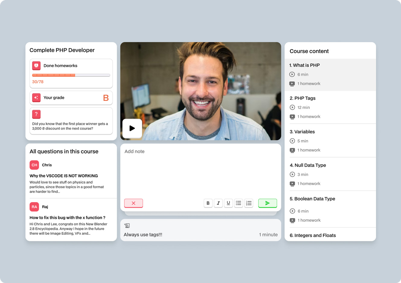
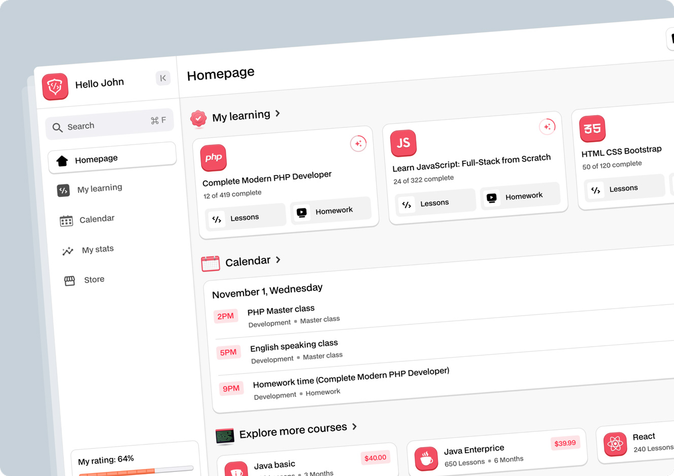
User research means gathering real feedback, running usability tests, and analyzing how people behave on your site.
Solution:
- Conduct usability testing
- Build user personas (fictional representations of your audience)
- Use heatmaps and session recordings
- Don’t rely on your gut — rely on data

Treating the Website as a Digital Brochure, Not a Sales Funnel
Why It’s a Problem:
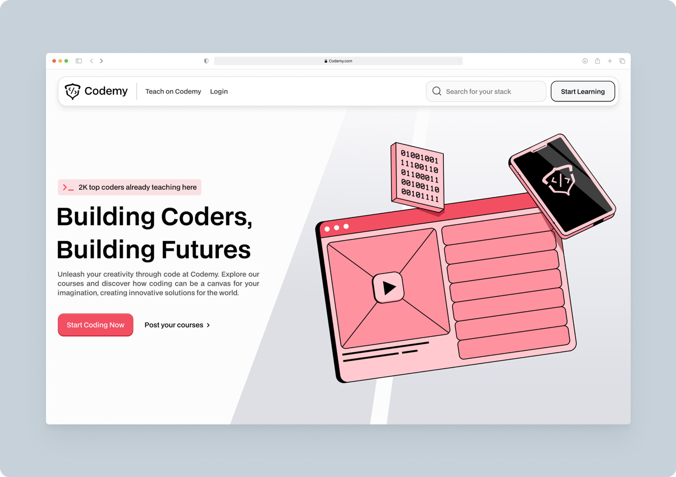
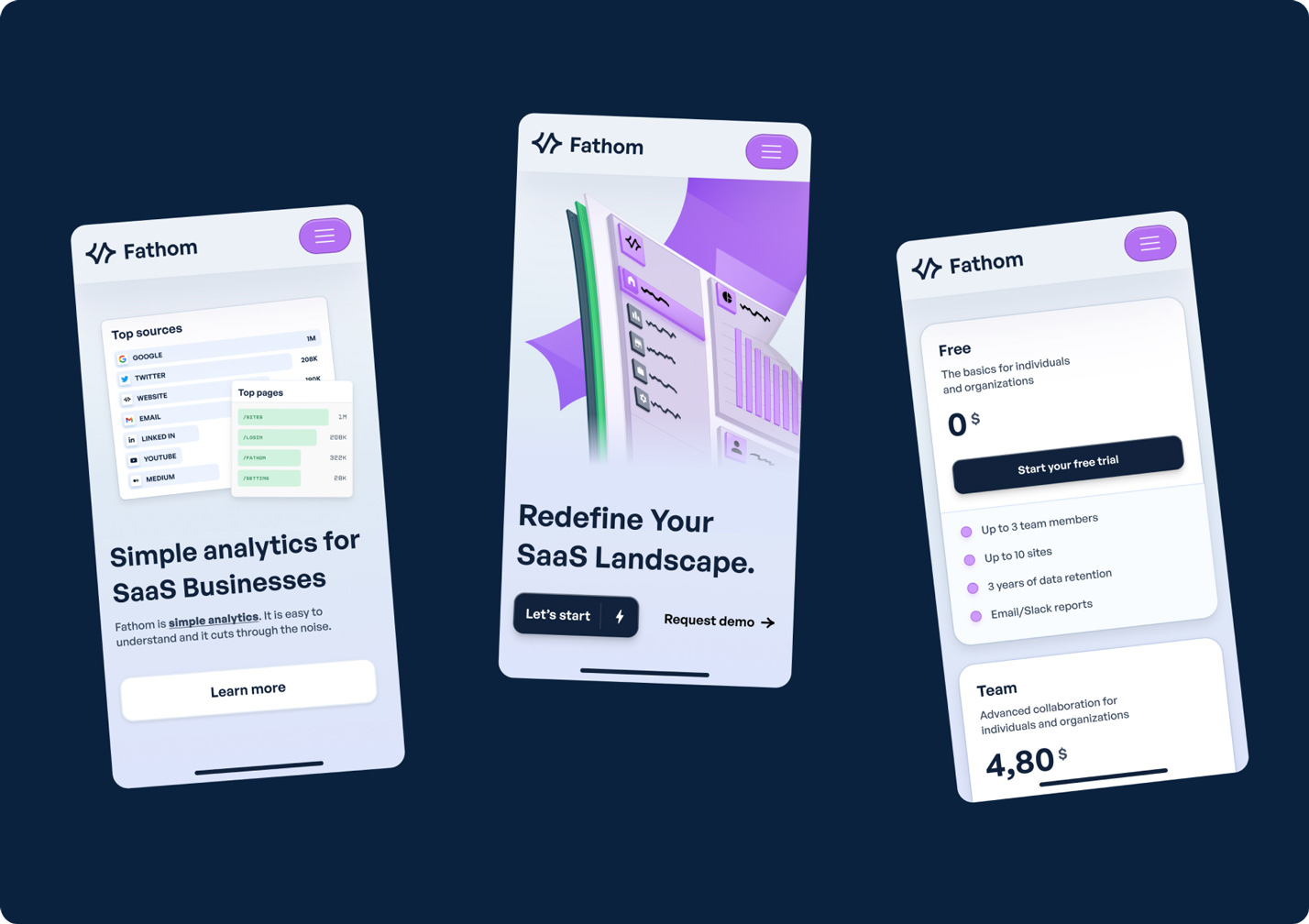
Your SaaS website isn’t a branding exercise — it’s a sales tool. Yet too many startups build websites that “look nice” but fail to convert.
A SaaS website should guide visitors from curiosity to action — fast. Every section should push them toward signing up, not just admiring your color palette.
Solution:
- Strong headlines explaining your value proposition
- Clear CTAs (Call to Actions) like “Start Free Trial” or “Book a Demo”
- Social proof: client logos, testimonials, case studies

Burying the CTA — Hope Your Users Bring Shovels
Why It’s a Problem:
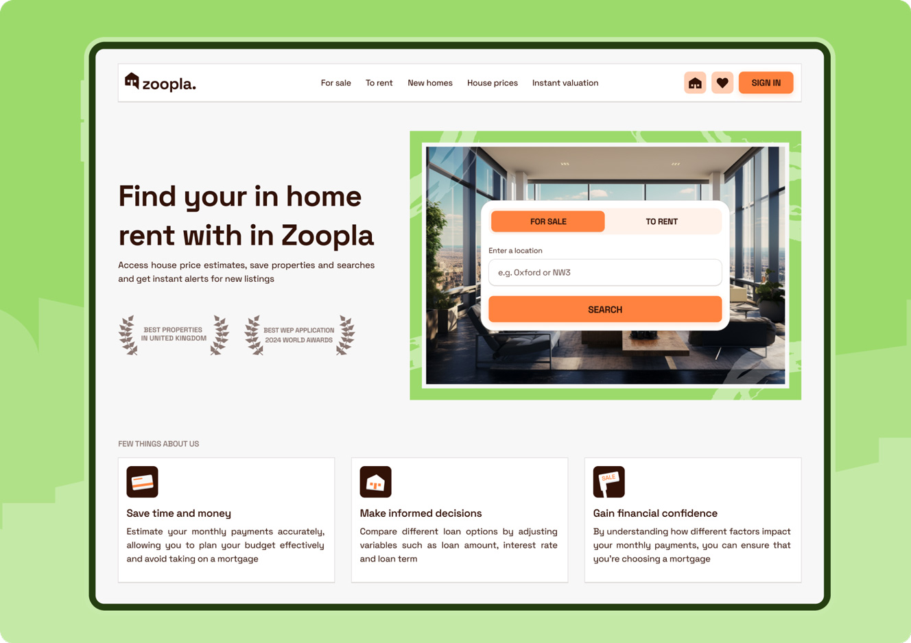
If your “Start Free Trial” button is harder to find than your Series A, you’ve got a problem. Users don’t dig. They bounce.
Solution:
- CTA above the fold
- Repeat CTA after every major section
Sticky header with a permanent CTA button

Underestimating Mobile Users — “Our Clients Are Desktop People”
Why It’s a Problem:
60%+ of SaaS website traffic comes from mobile devices. Still, many SaaS websites look like broken PowerPoints on smartphones.
Solution:
- Responsive design is non-negotiable
- Test on real devices, not just browser resizers
- Avoid hover interactions — thumbs don’t hover

Overloading Features — Forgetting People Buy Solutions, Not Checklists
Why It’s a Problem:
Pages packed with endless feature lists scream insecurity. Users care about outcomes, not your 147 integrations or JSON API.
Solution:
- Translate features into benefits
- Use simple, outcome-driven copy
- Focus on user pain points and how you solve them
Final Thoughts: Your SaaS Website Is a Sales Tool — Treat It Like One
There’s a simple reason SaaS startups fail at their websites: they forget it’s not art — it’s sales.
✅ Do the research.
✅ Fix the speed.
✅ Write like a human.
✅ And above all — sell the damn product.
Otherwise, enjoy your beautiful site… that nobody converts on.