Why Your Startup Website Is Confusing Everyone (Including You)
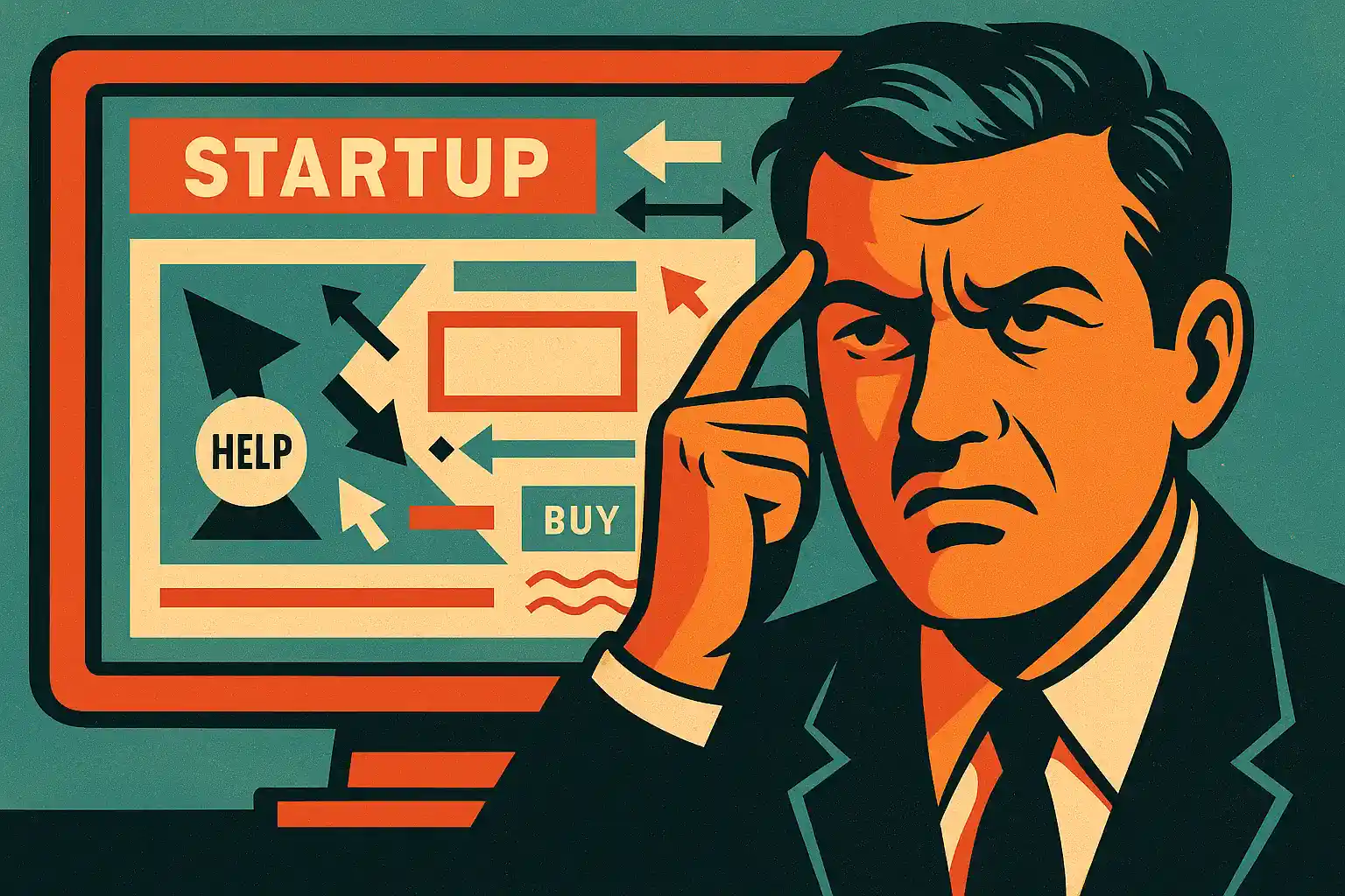
Let’s face it — your Startup Website is a beautiful disaster. You’ve got gradients that belong in a candy shop, a mission statement that reads like a riddle, and buttons that take users on a spiritual journey instead of the checkout page. But hey, at least the investors said it looks "modern," right?
As a UX/UI designer and co-founder of an IT outsourcing agency who has worked with enough startups to fill a small continent, let me walk you through the silent chaos that’s killing your conversion rate — and how to clean it up.
The Most Common Startup Website Mistakes (And Why They Keep Happening)
1. You’re Building a Brand, Not a Website
Yes, branding is essential. But when your Startup Website forgets it’s supposed to be useful, you’ve entered dangerous territory. A user doesn’t care that your primary blue is Pantone-approved. They want to know what you do. Immediately.
If your homepage opens with an abstract metaphor like "We empower synergy for tomorrow," congratulations — you’ve officially said nothing.
2. You Hired a Dribbble Designer Without Real-World Experience
We love Dribbble. It's where good designers go to forget users exist. Visuals are one thing, but designing a Startup Website means understanding user behavior, information architecture (a fancy way of saying "put stuff where people expect it"), and cognitive load (aka how not to make people cry while finding your pricing page).
3. You Prioritized Looks Over Logic
Function before form is not just a UX mantra — it's survival. Your Startup Website should be designed for lazy, distracted people who want results fast. If your navigation is hidden inside a creative hamburger menu shaped like a rocket ship, you’re doing it wrong.
What a Good Startup Website Actually Needs
Clear Value Proposition
When a visitor lands on your site, they should know:
What you do
Who it’s for
Why it matters All within 5 seconds. Anything more and they’re gone. Possibly forever.
Is Your Startup Website Leaving People Confused?
Find Out Why It’s Not Just Them — It’s Your Website.
Think of your Startup Website like a map. If users get lost, they won’t ask for directions — they’ll close the tab. Keep things simple: Home, Features, Pricing, About, Contact. Bonus points if the buttons don’t teleport users to unrelated pages.
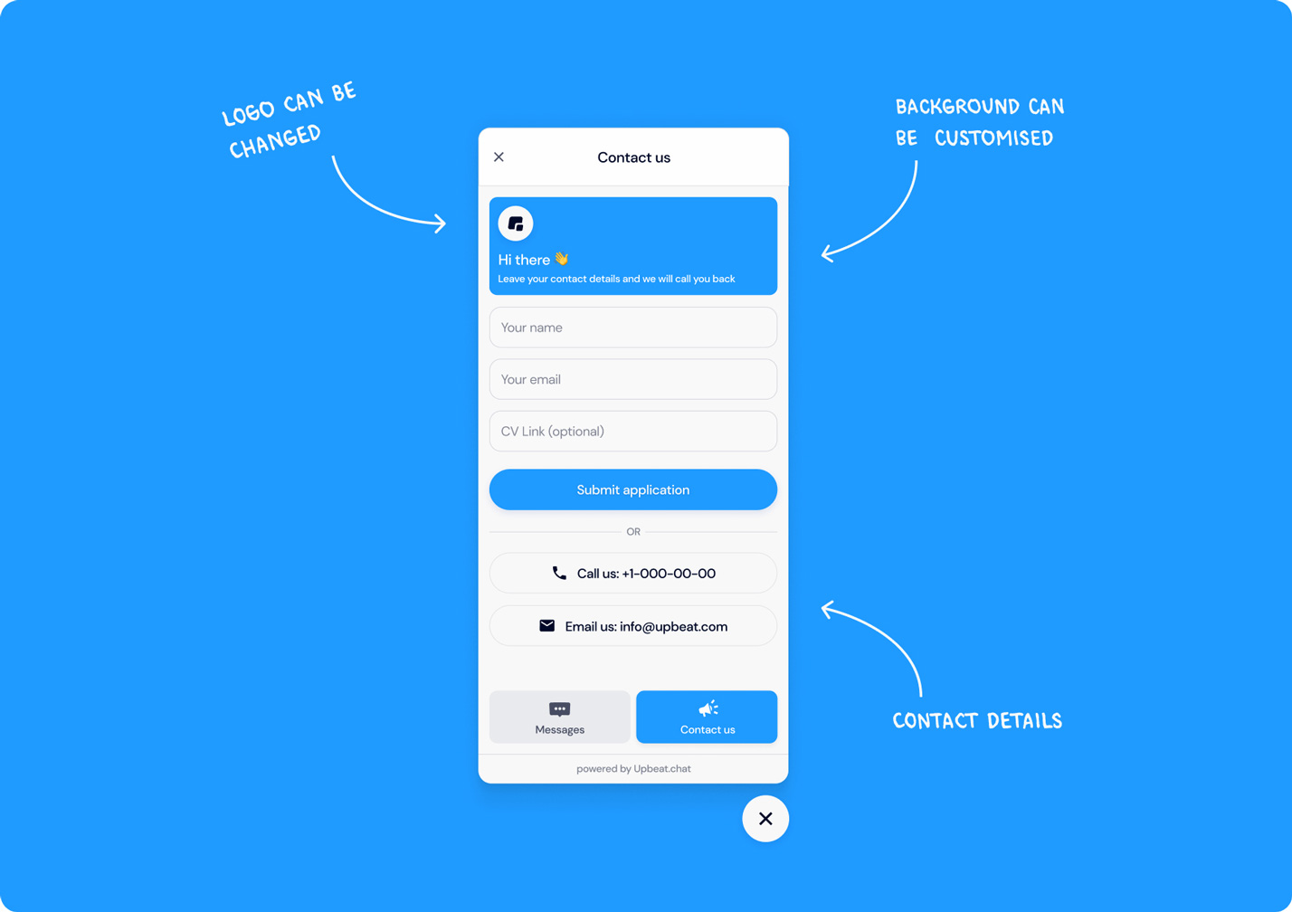
Real Content
Stock images of handshakes and diversity stock photos aren’t helping. Nor are vague claims like "We revolutionize innovation." Replace fluff with actual features, customer quotes, or even screenshots. And please — if you’re B2B, say it like you’re talking to a human, not a boardroom.
Responsive and Fast
Your Startup Website needs to be responsive. That means it works on all screen sizes and loads in under 3 seconds. You wouldn’t tolerate a slow app — your users won’t either. Bonus: Google punishes slow sites in SEO rankings. Now you care.
But What About Storytelling?
Ah yes, storytelling — that sacred cow of startup marketing. A compelling brand narrative is great, but don’t mistake storytelling for verbal gymnastics. A good Startup Website tells a story by making sense, not by turning into a choose-your-own-adventure.
Warning Signs You Need a Redesign
People ask, "So what does your company actually do?"
Your bounce rate is sky-high
You get traffic but no conversions
Your grandma can’t find the CTA
If three or more apply, it’s time to fix it. And yes, we can help — that’s kind of our thing.
Your Startup Website is your first impression, your elevator pitch, and your sales funnel — all in one. If it’s confusing people (including you), it's not doing its job. You don’t need to burn it all down. But you do need to stop letting design trends and internal bias guide your decisions.
Prioritize clarity. Focus on users. Work with designers who understand both business and behavior. And please — stop hiding your pricing like it’s a national secret.
Because in the end, it’s not about winning design awards. It’s about making something that actually works. You can always make it pretty after it stops confusing everyone.
Egor Mihachkin
Designer
Egor has over 6 years of experience as a UX UI Designer & Graphic designer, he loves to create products that deliver value