

The Sitemap Guide for Startups: Structure Before Style
Here is a red flag worth knowing up front: if someone offers you a wireframing process as the first step to designing a website, they do not really understand web. For websites, the real UX work is deciding what content matters and how it is organized, not pushing grey boxes around in Figma. That work happens in the sitemap, and getting it right before the design phase is one of the highest-impact things a startup can do. This is the practical guide to sitemaps that actually serve your business.
Why Is a Sitemap Even Needed?
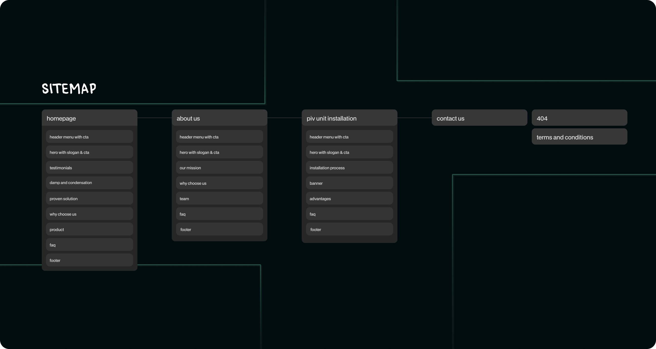
A sitemap is your content and conversion strategy in disguise. Long before any visuals, it forces the decisions that determine whether your site works. A good sitemap helps you define your core structure before the design phase eats your budget, map the key content that matters to both users and search engines, and decide what a visitor sees first and where you want them to go next.
Sitemaps are underrated precisely because they are not glamorous. There are no beautiful screens to admire, just a clear map of what goes where and why. But skipping this step is how startups end up redesigning three months after launch, when they realize the structure never matched how customers actually think. The sitemap is where you prevent that expensive mistake.
What Is a Sitemap Based On?
A good sitemap is not invented from thin air or copied from a competitor. It is built on real inputs: who your users are, what they came to do, and what you want them to do next. It starts with your business goals and your users' goals, then organizes content so those two sets of goals meet as efficiently as possible.
That means thinking about the journey, not just the pages. What does a first-time visitor need to understand before they trust you? What is the shortest path from curiosity to signup? Which content supports that path, and which is just noise? A sitemap based on these questions produces a site that guides people, while one based on "what pages do competitors have" produces a generic structure that serves no one in particular.
Sitemaps for Startups: The Good, the Bad, and the Unfunded
Good Example: Linear
Look at how Linear structures its site. The path is obvious: you immediately understand what the product does, who it is for, and what to do next. The structure is ruthlessly focused, with no wandering, no clutter, just a clear journey from landing to understanding to action. That clarity is not an accident, it is the result of deciding what matters before designing anything.
Bad Example: "Mystery SaaS" Syndrome
Then there is the all-too-common opposite, the startup whose site leaves you genuinely unsure what they even do after a full minute of clicking around. The navigation sprawls, the homepage hedges, and the content is organized by internal logic rather than user need. This is "Mystery SaaS" syndrome, and it is almost always a sitemap problem, not a design problem. No amount of beautiful visuals fixes a structure that confuses people about the basics.
Moral of the Story
The difference between Linear and Mystery SaaS is not budget or design talent, it is whether someone did the unglamorous work of structuring the content around the user before opening a design tool. A clear sitemap makes a modest design feel professional. A muddled one makes even beautiful design feel confusing. Structure is the foundation everything else stands on.
How to Build a Startup Sitemap That Works
Start with your goals and your users' goals written down plainly. List the content and pages that genuinely serve those goals, and be ruthless about cutting what does not. Then organize them into a logical hierarchy, with the most important paths shortest and clearest. Map the journey you want visitors to take, from first impression to conversion, and make sure the structure supports it at every step.
Keep it as simple as it can be while still covering what users need. A startup site rarely needs dozens of pages, it needs a few excellent ones arranged in an order that makes sense. Resist the urge to add pages because competitors have them. Every page should earn its place by serving a real user need or a real business goal, ideally both.
The Sitemap Is Where Strategy Becomes Structure
The reason a sitemap matters so much is that it is where abstract business strategy turns into concrete structure. You can have the clearest positioning in the world, but if it is not reflected in how your site is organized, visitors will never feel it. The sitemap is the bridge between what you want to communicate and how people actually experience your site, page by page.
This is also why the sitemap should involve more than a designer or developer. It is a business decision as much as a UX one, because it encodes what you want visitors to notice first, what action you want them to take, and how you guide them there. Treating it as a throwaway technical step misses the point entirely. Done well, the sitemap quietly aligns your whole site with your goals, which is worth far more than any individual beautiful screen.
Final Word (But Not a Soft One)
The sitemap is the single most underrated step in building a startup website, and skipping it is how budgets get wasted and sites get rebuilt. Before anyone designs a screen, decide what content matters and how it is organized around your users and your goals. Do that work honestly and even a simple site will feel clear and professional. Skip it, and no amount of visual polish will save you from Mystery SaaS syndrome. Structure first, style second, always, because a beautiful site nobody understands is just an expensive way to confuse people.


_3i6y1psormuf876mu.png)
